HOUSECANARY
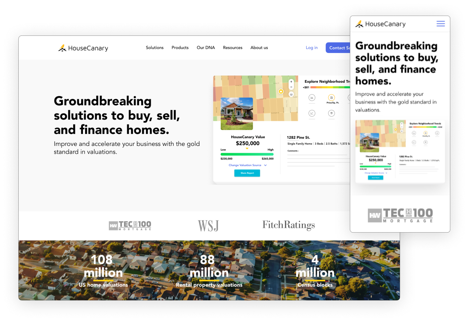
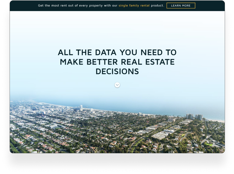
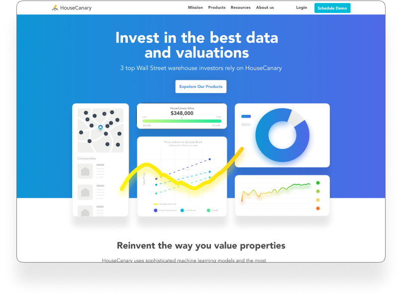
Website
Website
Intro.
Role: | Visual Designer | UX Designer | Prototyper
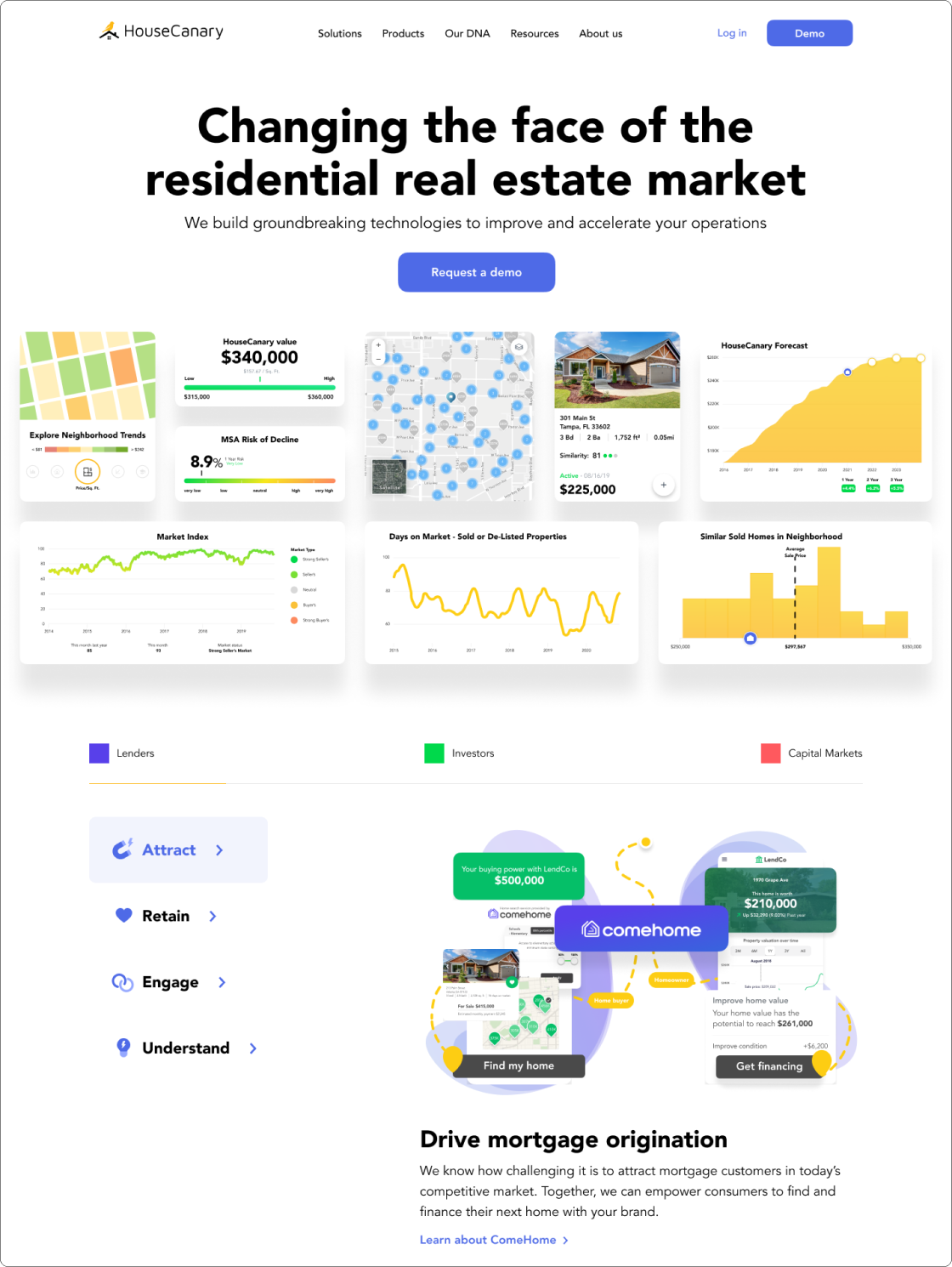
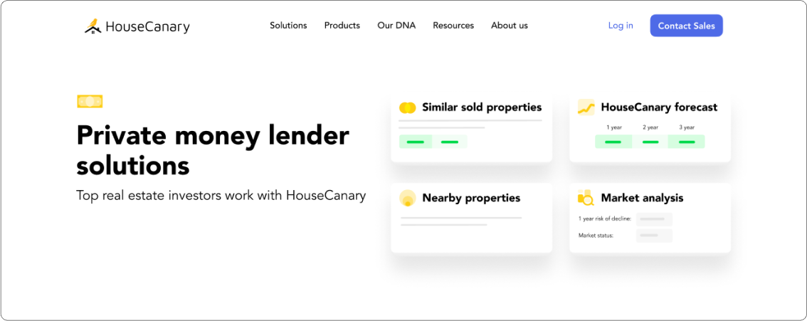
HouseCanary is a real estate analytics platform that helps investors find and value properties. The need for a redesign and rebranding of HouseCanary's website first came about to differentiate it from competitors in the real estate valuation and analytics space. I collaborated with content marketers, copy editors, and developers to create an experience that would build upon and compliment the new visual direction our product was headed while educating prospective customers with digestible glimpses of our products and services. As lead designer, my role was to research and create a new visual language, conceptualize new ways of displaying data and analytics, and to create a good user experience for site visitors.
Problem.
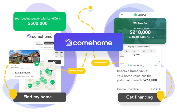
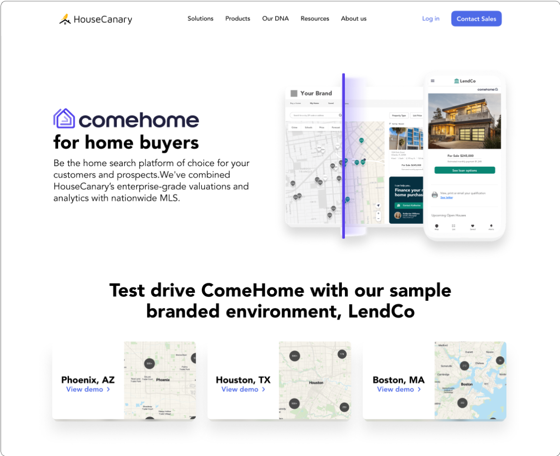
HouseCanary was about to launch a new brand, ComeHome, that was aimed more at consumers and not it’s traditional investment customers. Since ComeHome was directed at a different type of customer it adopted a friendlier and less formal design language. Over the period of a year, we’d begun to explore a new design language for our brand and website, but with the launch of ComeHome we had to find a design language that could bridge the gap between the two brands.
OLD
TRANSITIONAL
FUTURE

Site Audit.
One of the first things I did was to meet with members of the marketing team and figure out what pages we wanted on the website.
This would make it easier to:
- Have a clear plan of what pages needed to be worked on.
- Create a skeleton for the site navigation.
- Give a good indication of which pages could make use of templates and which pages would need a bit more customization and attention to detail.
- Get everyone aligned on priorities.

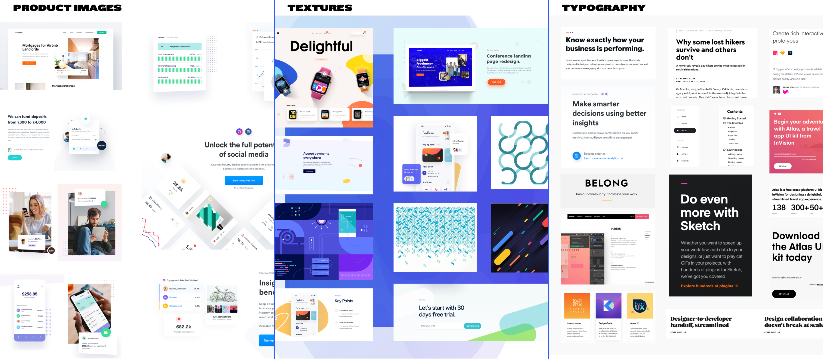
Inspiration.
Grids.
SETTINGS
1440PX
LARGE DESKTOP
COLUMNS: 12
COLUMN WIDTH: 70PX
GUTTER: 30PX
960PX
SMALL DESKTOP/TABLET
COLUMNS: 12
COLUMN WIDTH: 60PX
GUTTER: 20PX
428PX
LARGE PHONE
COLUMNS: 6
COLUMN WIDTH: 50PX
GUTTER: 20PX
375PX
SMALLER PHONE
COLUMNS: 5
COLUMN WIDTH: 50PX
GUTTER: 20PX

Sketches.
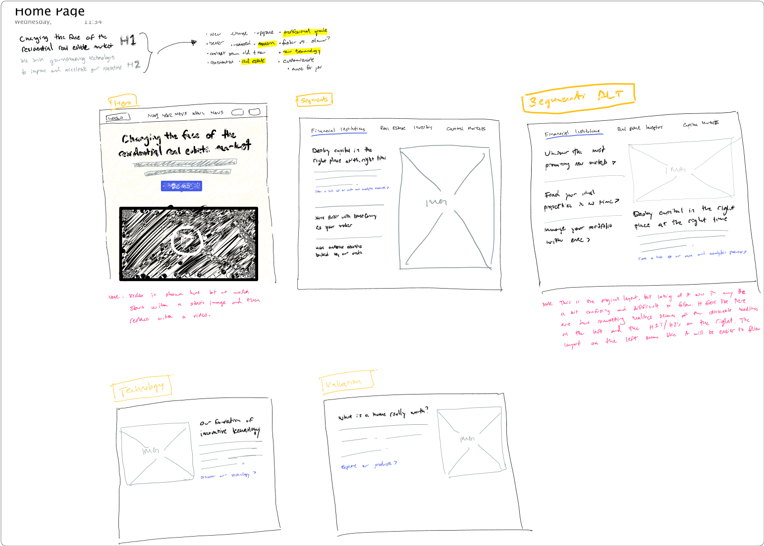
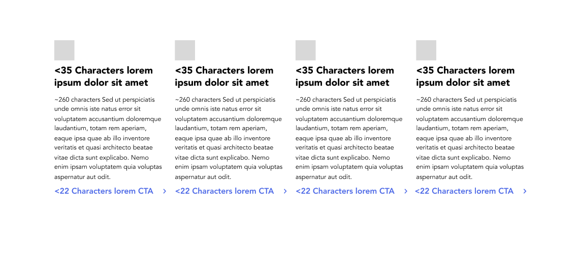
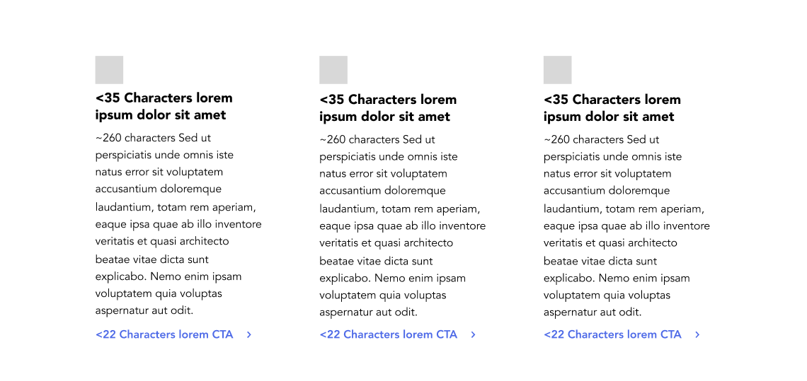
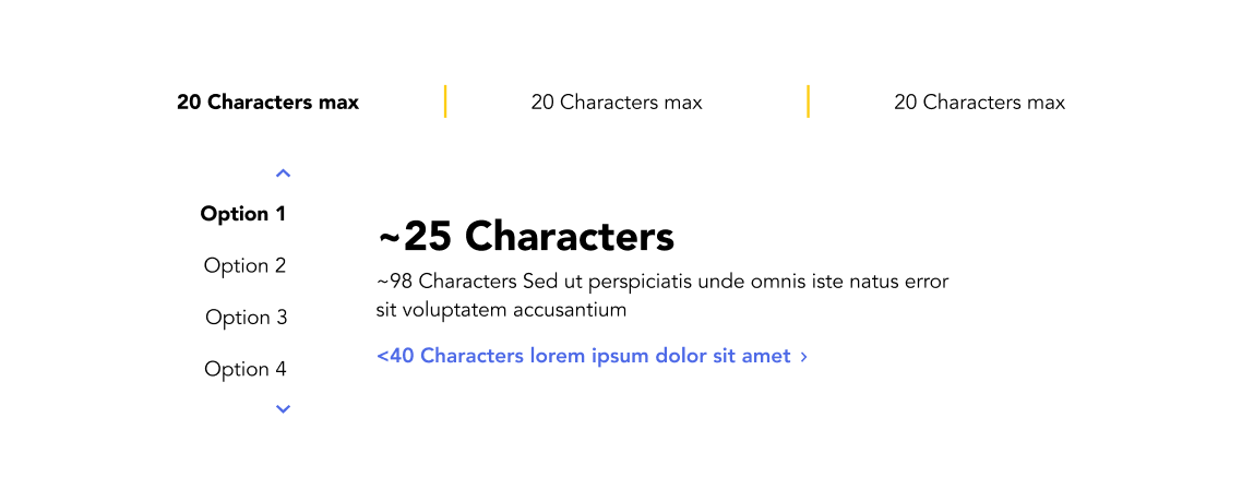
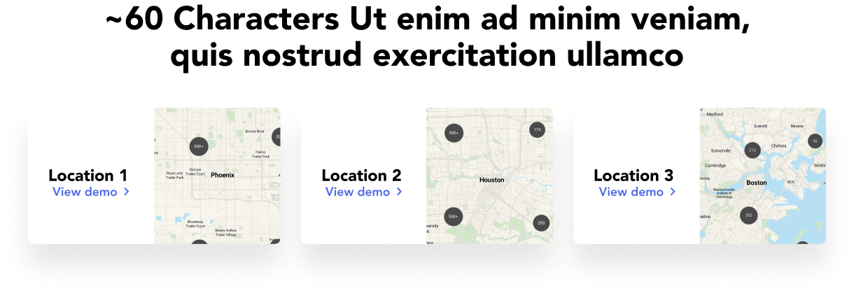
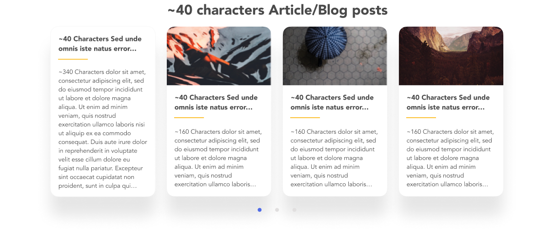
Site Modules.
In order to create a more systematic design and development process, we decided to design reusable site modules. I started off by taking inventory of the different possible types of modules and sketching them out, followed by wireframing for structure and layout, then moving onto typography and light visual styling, allowing developers to get a better sense of sizing, spacing, and treatment of certain elements such as box shadows and images.


Page Templates.
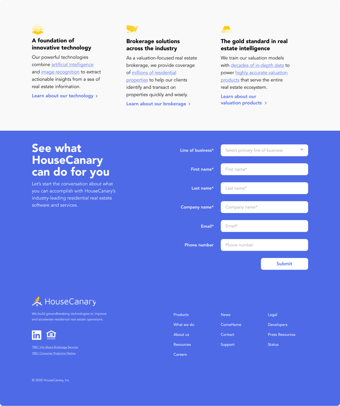
Exploring Visuals.
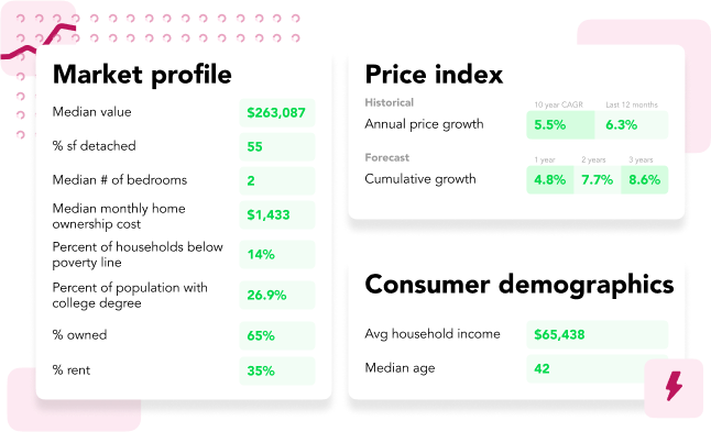
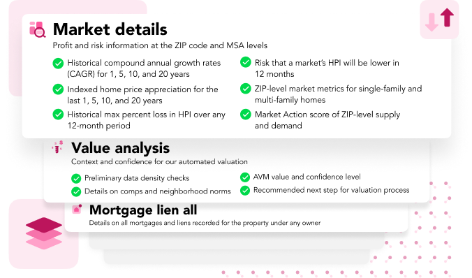
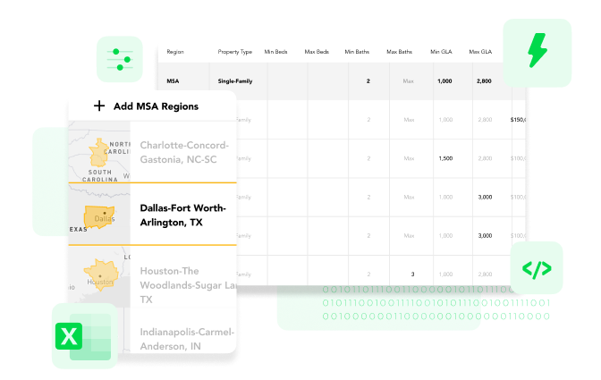
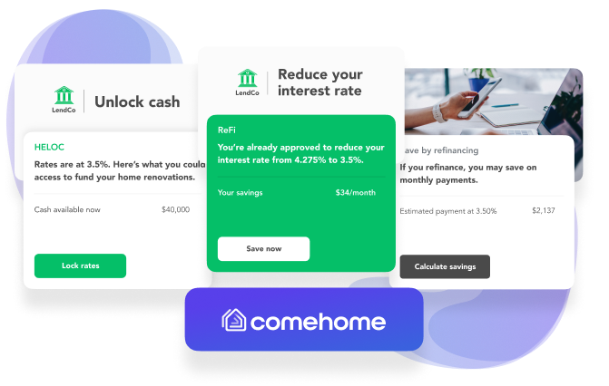
Since the reports were dense with information it made sense to pop out and highlight smaller pieces of info depending on what we wanted to highlight in a given section/module. I experimented with different backgournd background colors an textures for different product segments.
FIRST ROUND VISUALS
FIRST ROUND HOME PAGE
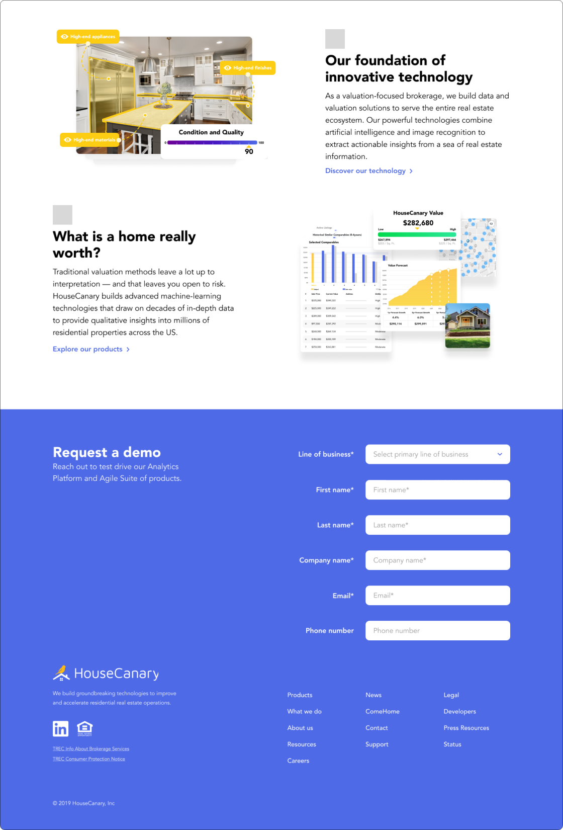
Revisiting Visuals.
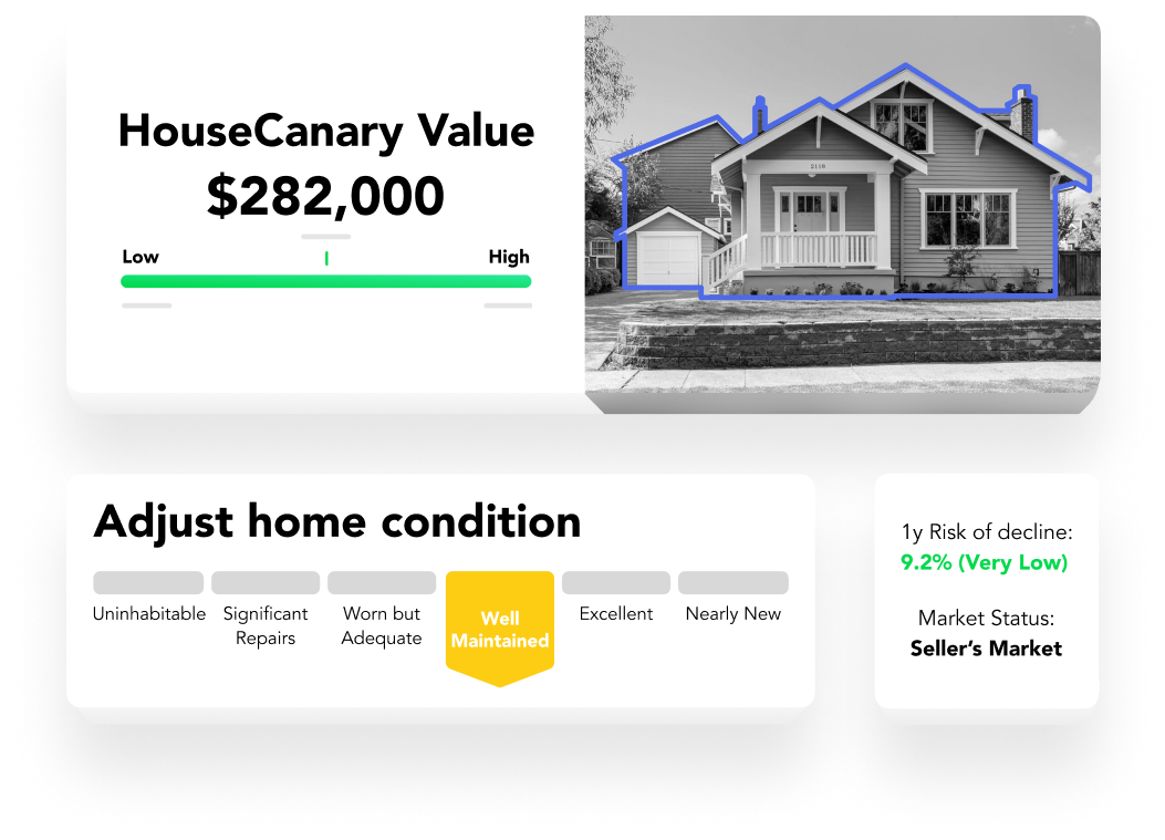
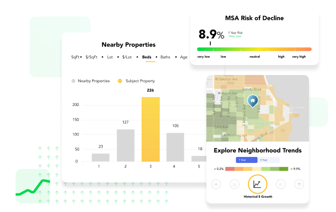
One of the pieces of feedback I received was that the background textures were distracting, so I removed them. I also began to use 3D tiles to highlight the different parts of the reports/UI.
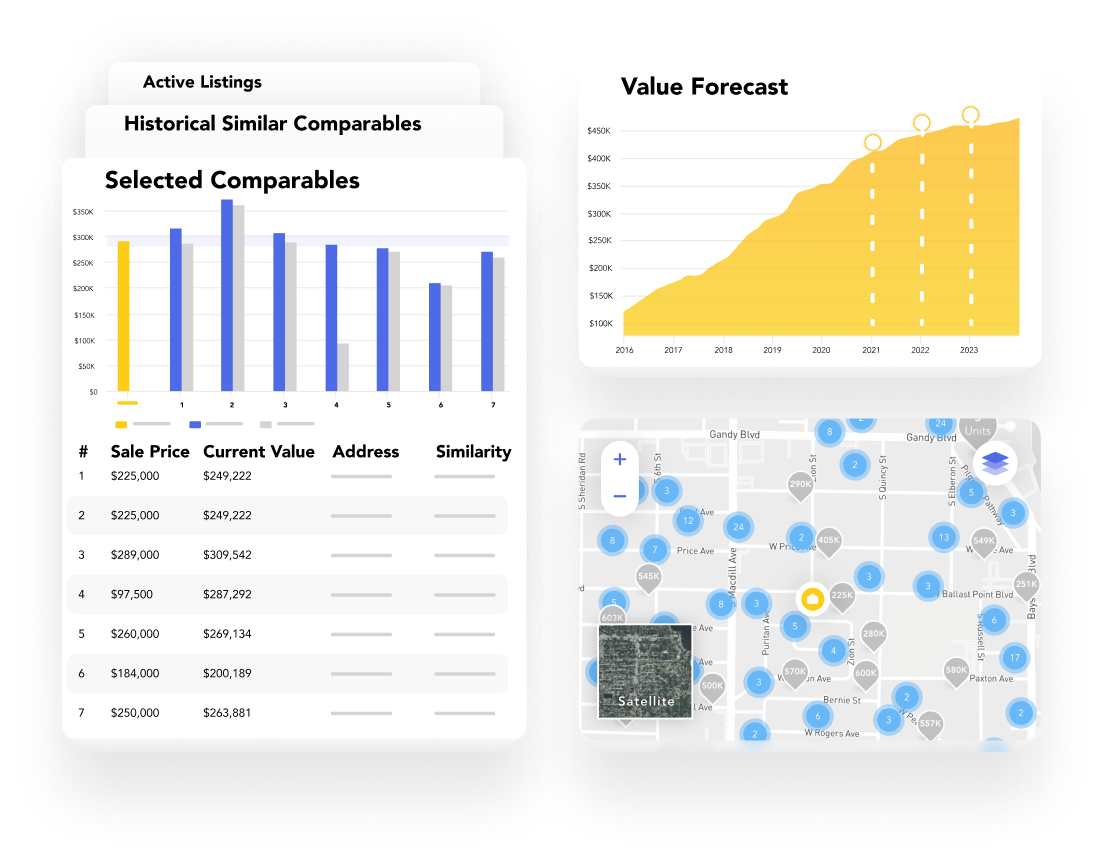
Another piece of feedback I addressed was that overlaying too many elements was distracting as well. I thought it through and decided that overlapping elements should only be used when showing a grouping of things or if we wanted to show some sort of progression of time.
SECOND ROUND HOME PAGE
Typography.


Navigation.
DESKTOP
MAIN NAV STRUCTURE AND HOVER

SUB NAV HOVER

MOBILE


Colors.
NORMAL VISION

DEUTERANOPIA VISION

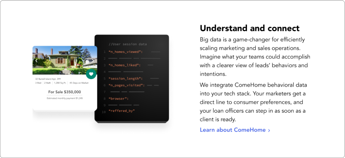
HouseCanary’s product relies heavily on choloropeth maps (heat maps) to visualize the data generated from their reports. Selecting colors that are more easily differentiated by people with visual differences was something that I kept front of mind when thinking about the maps we’d show on the site.
BRAND COLORS

EXTENDED PALETTE

Iconography.
ICONS

ICON COLORS

ICON STYLES

UI Styles.
BUTTONS

TEXT LINKS

DROPDOWNS

INPUTS

SEARCH

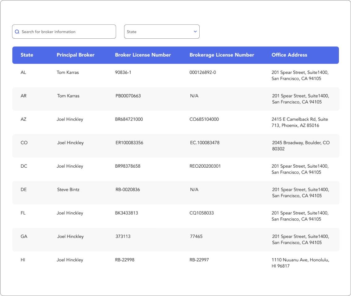
TABLE STYLES

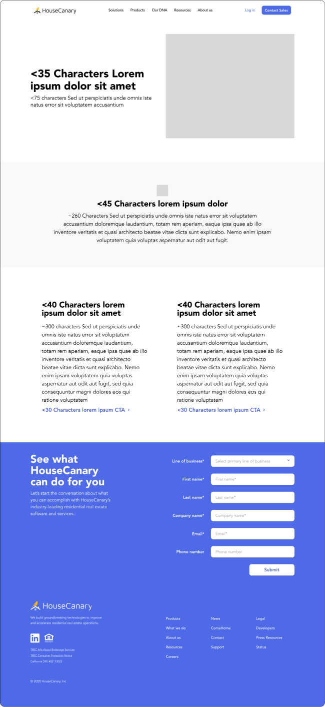
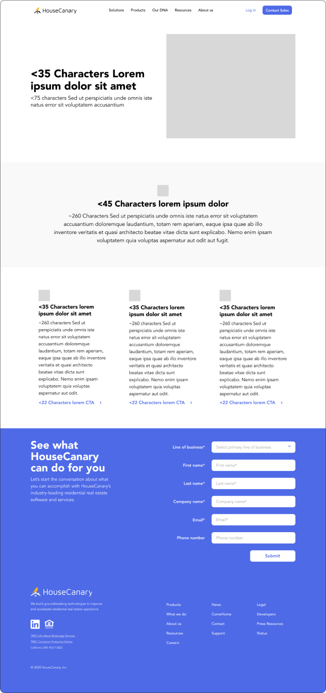
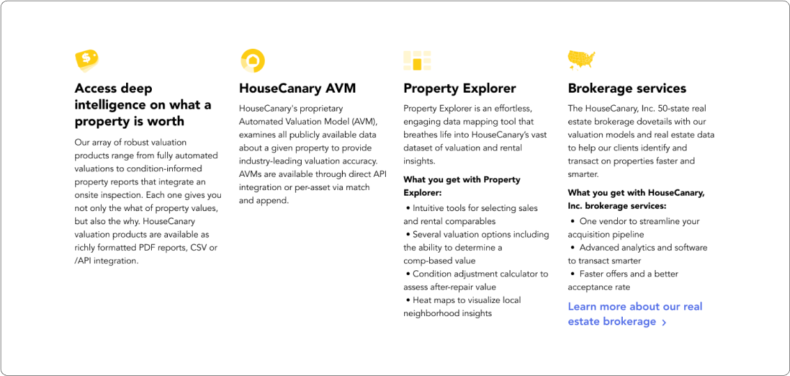
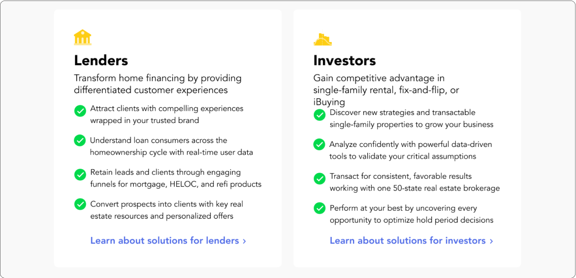
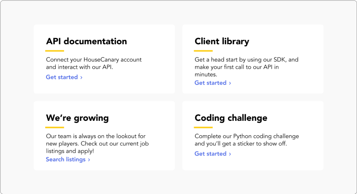
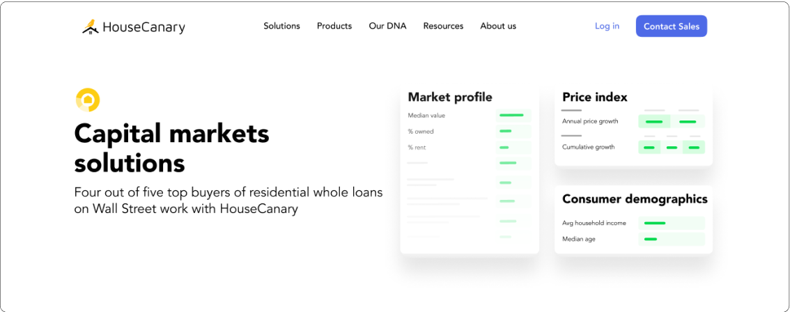
Putting it together.
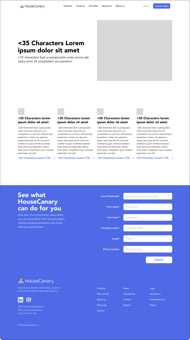
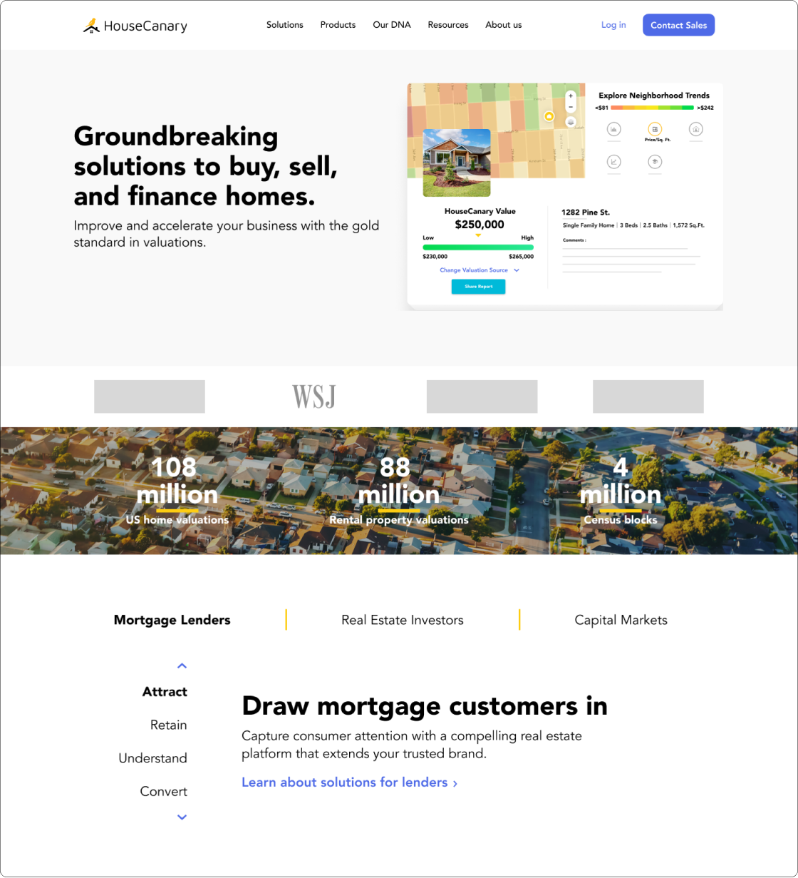
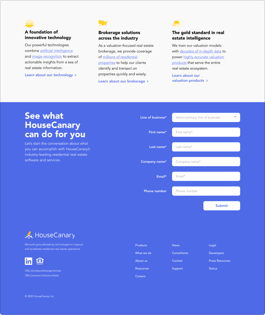
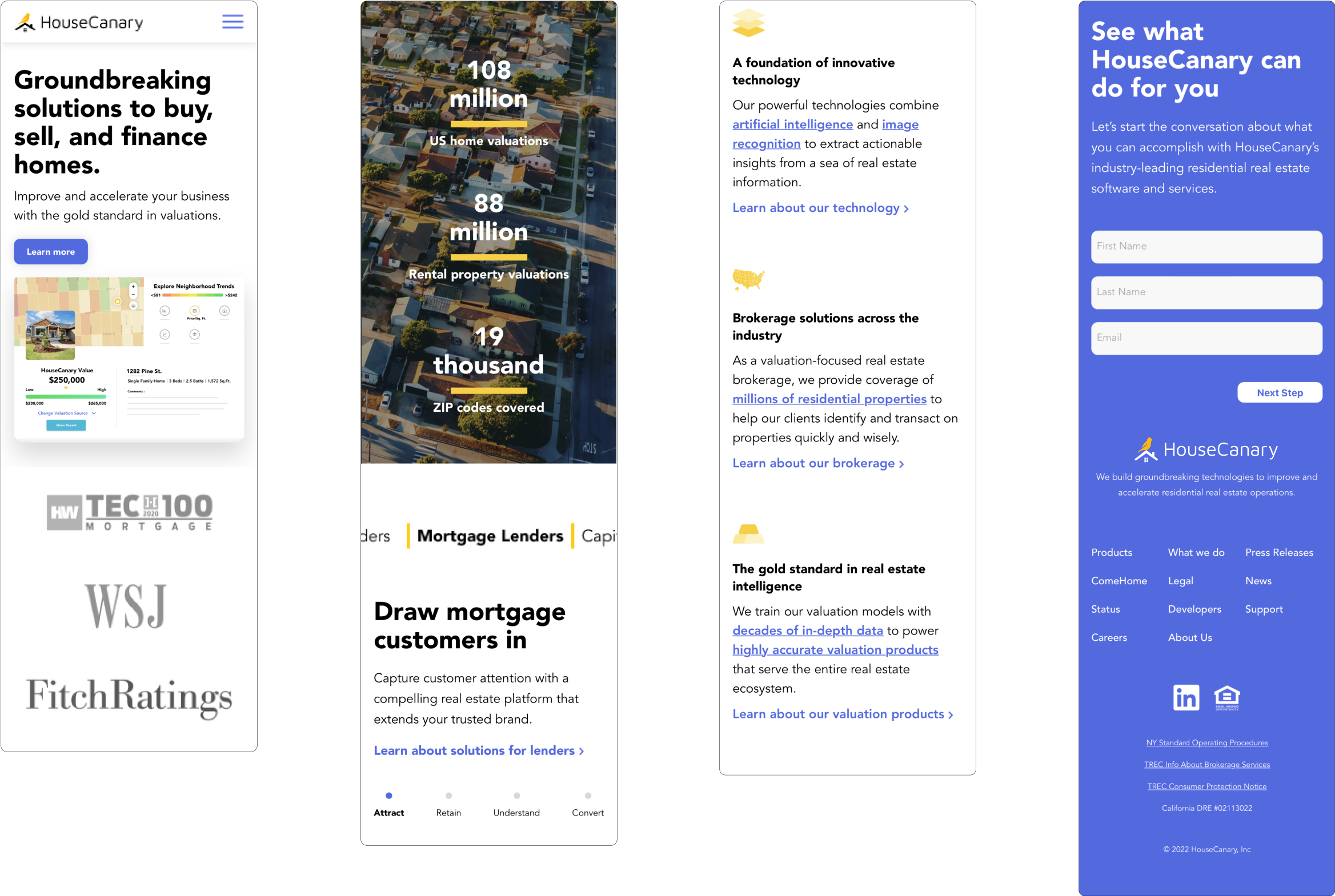
HOME PAGE—DESKTOP
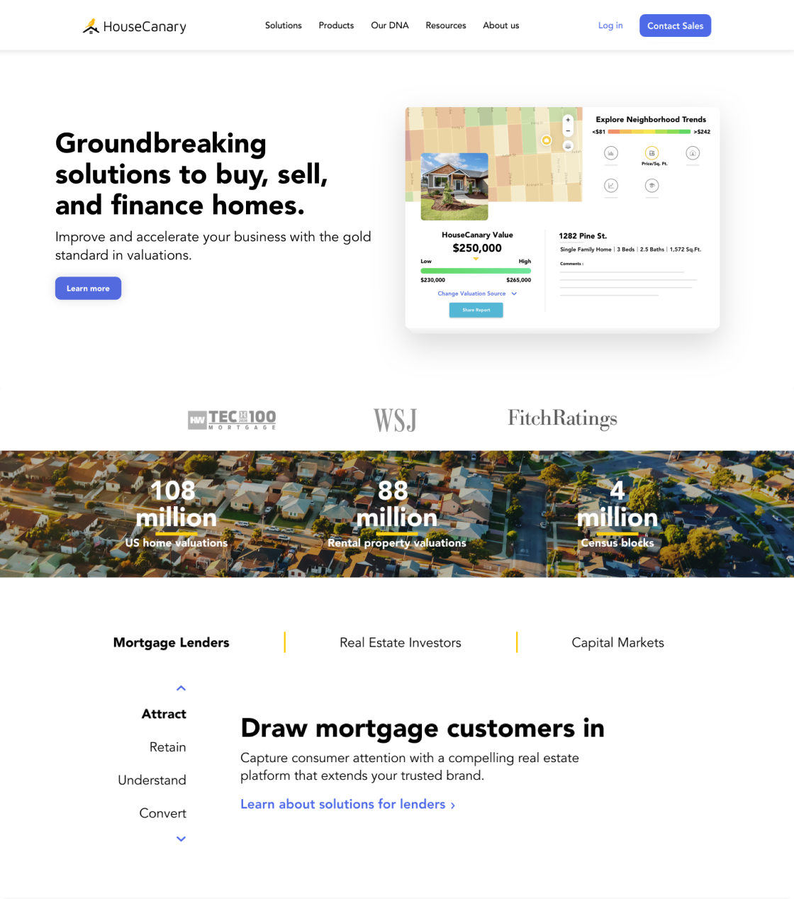
HOME PAGE—MOBILE
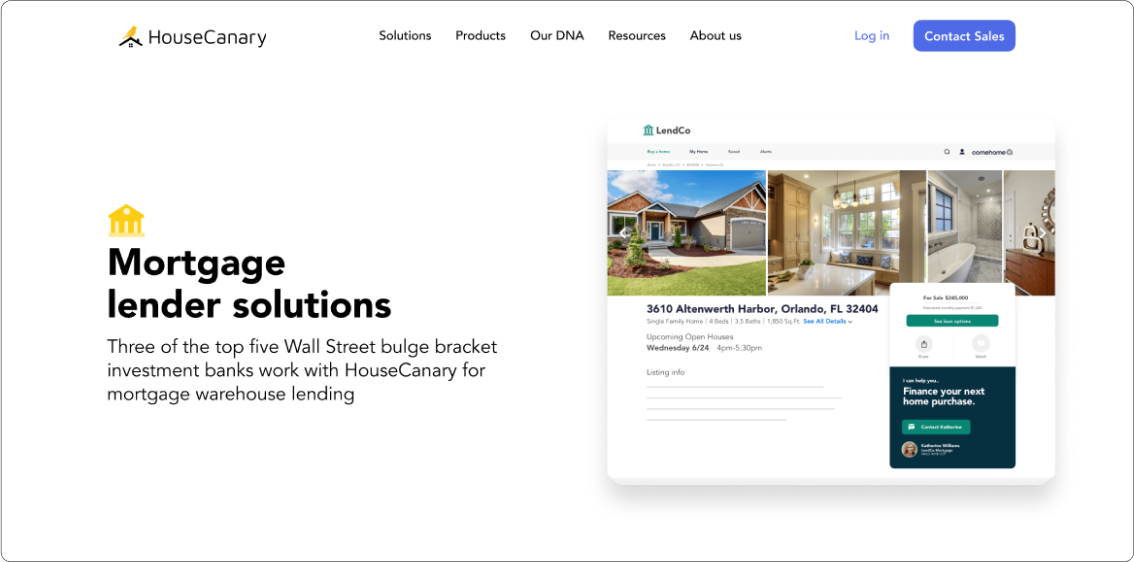
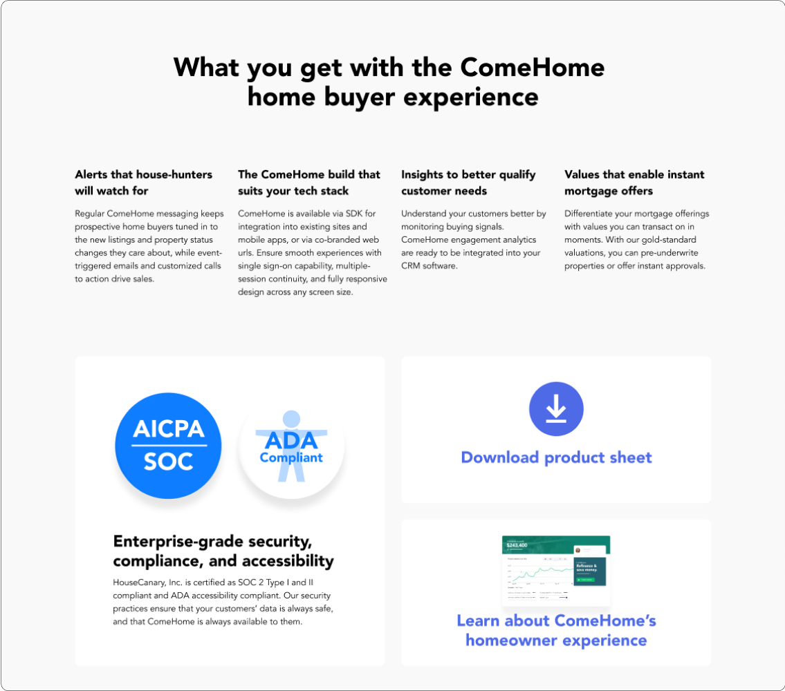
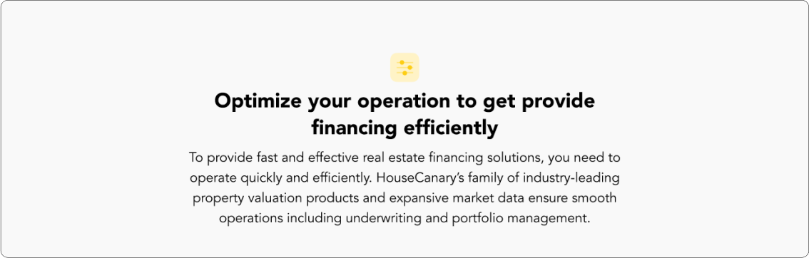
SOLUTIONS
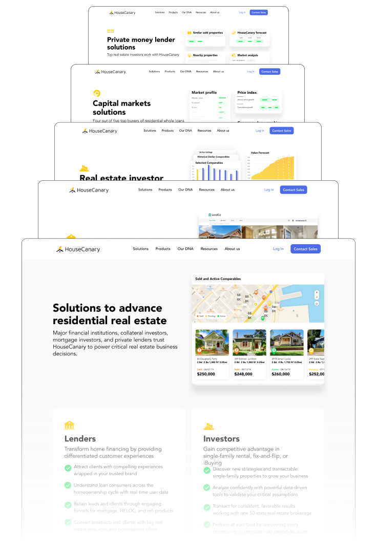
PRODUCT
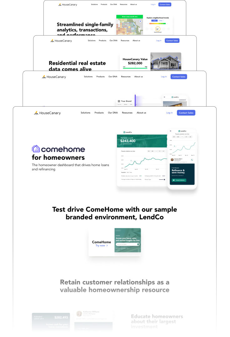
DNA & RESOURCES
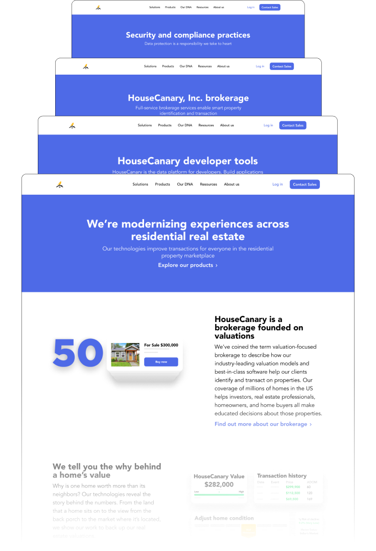
CLOSE UPS


Takeaways.
THINKING SYSTEMATICALLY
One of the early decisions that really helped focus this project was the use of site modules. Having a few templated layouts allowed me to put together rough layouts of full pages for the marketing team so that our editors and writers could begin to fill in different parts of the site with content. Once their content was in, it allowed me to get a better sense of what visuals should be used. Overall it allowed everyone to ideate more quickly and to get to a solution a lot faster.
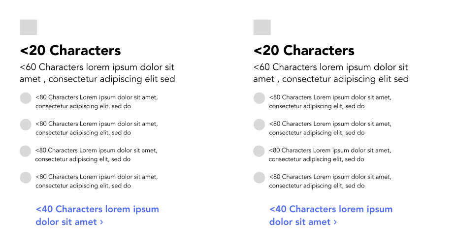
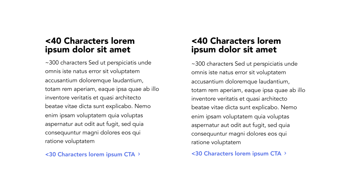
CHARACTER LIMITS
Typograhy can be used as a visual guide to direct the viewer’s focus and should be in used in a balanced way so that it isn’t too overwhelming. Character limits in the site modules served as reminders to copy writers to try and respect that balance. As the process of designing and buidling the site moved forward, character limits were adjusted and some suggestions even highlighted the needs for new modules.
COLLABORATION
The title of this section says it all. Being able to bounce ideas off of other colleagues is something that I really enjoy and on a project of this size was something that was necessary.