BASIS AN INTEL COMPANY
Checkout Flow
Intro.
Roles | Visual Designer | UX Designer | Prototyper
Basis was a pioneer in the fitness wearables market and while there I was tasked with redesigning the checkout flow for the company's online store. As a startup, Basis relied heavily on converting sales via their online store so my main area of focus was to reduce friction in the online buying process.
What are we solving for?
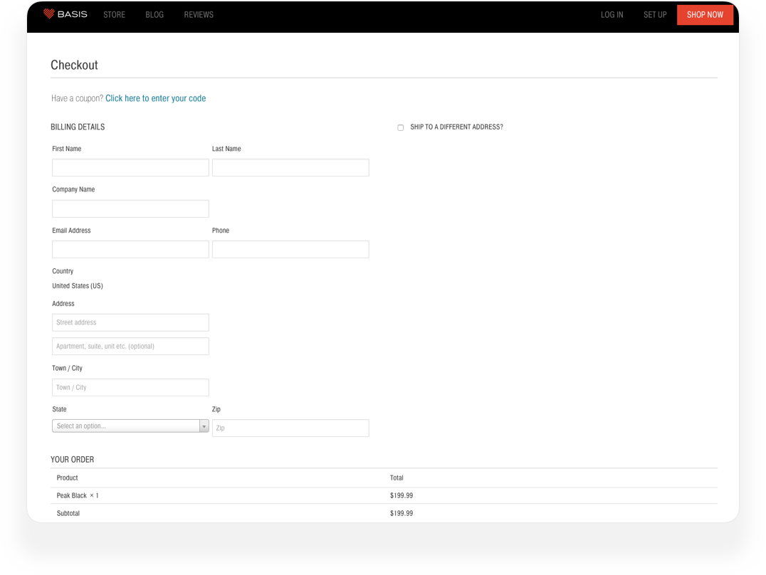
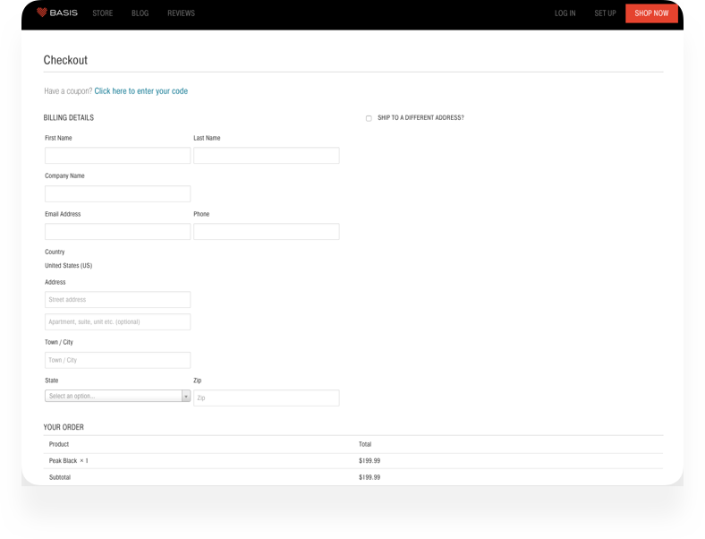
When I started the project the online store was using the default checkout flow provided by our credit card processing vendor. There were a couple of issues with this:
- The checkout page was a long form that took up a lot of vertical space. It was pretty daunting and the form was difficult to use on mobile devices.
- There wasn't any "Basis" branding other than our nav and the footer. Because of this, people didn't trust the checkout process and didn't think it was safe to enter their credit card info.
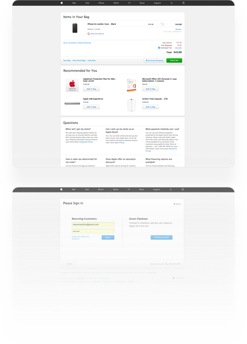
Old Design
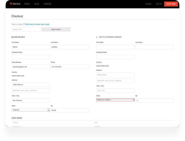
Proposed Solution
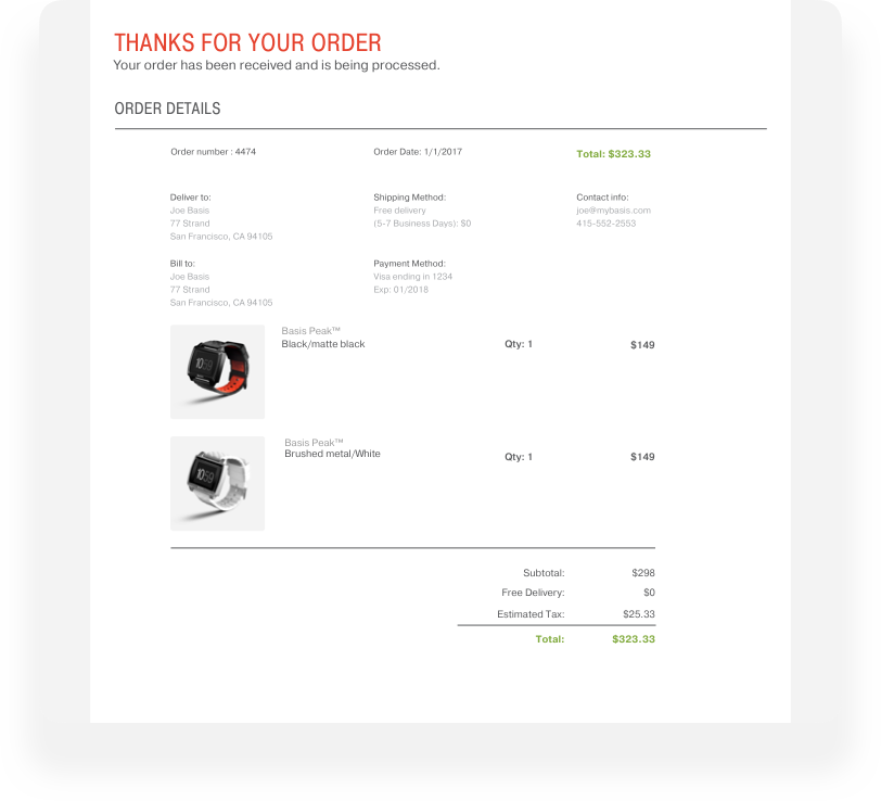
Solution
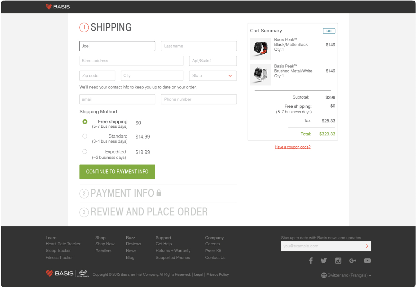
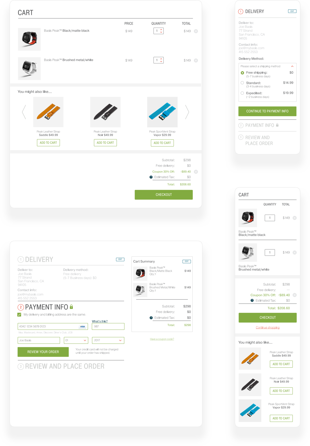
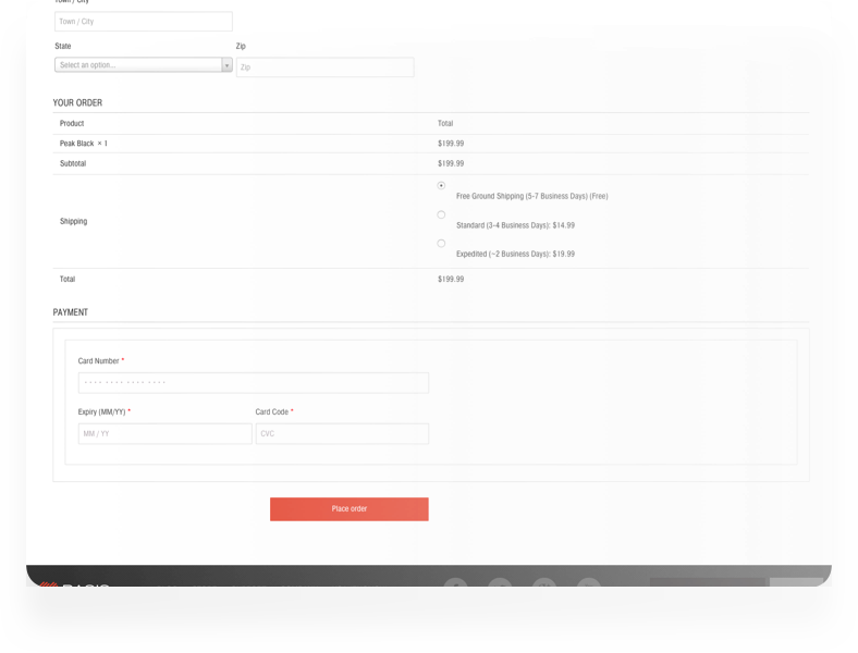
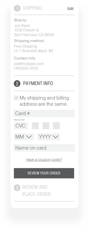
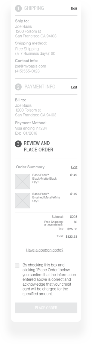
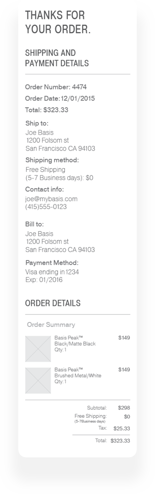
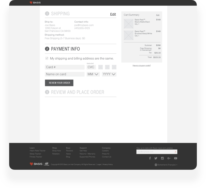
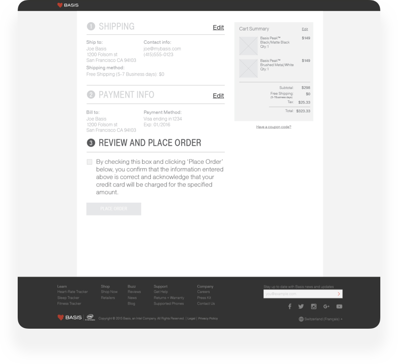
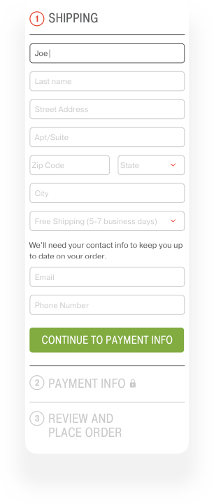
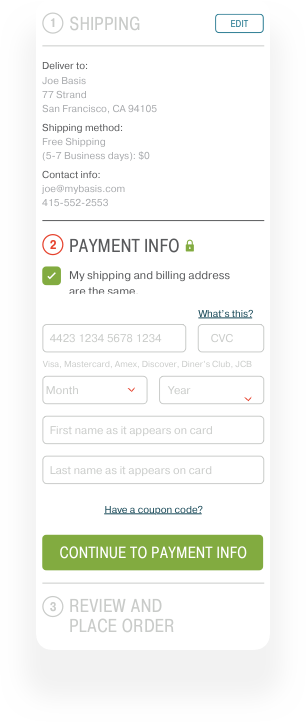
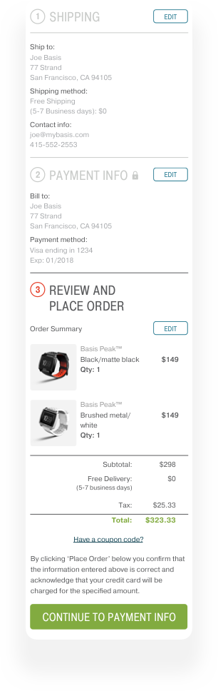
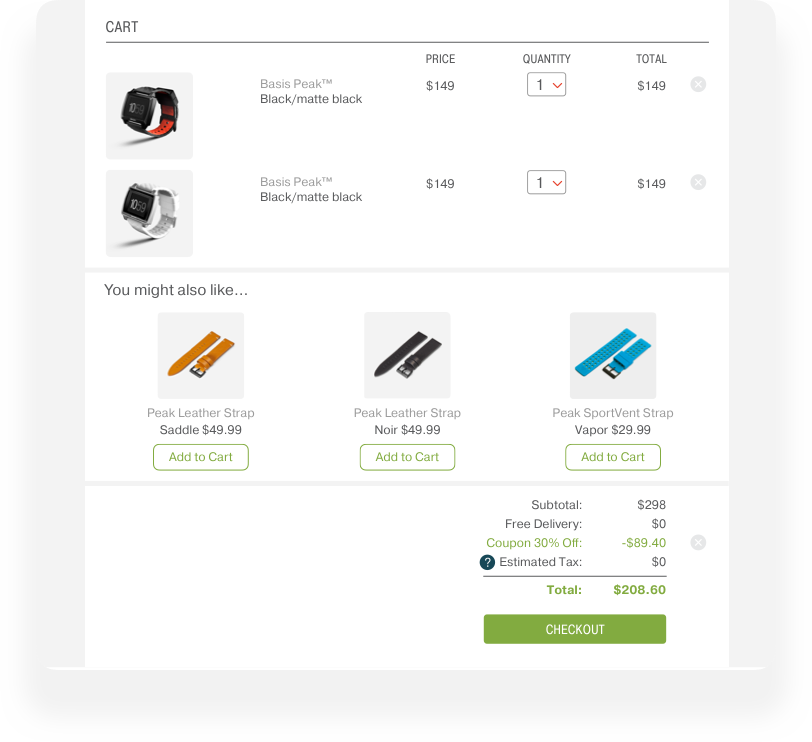
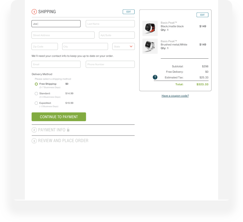
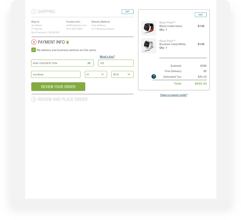
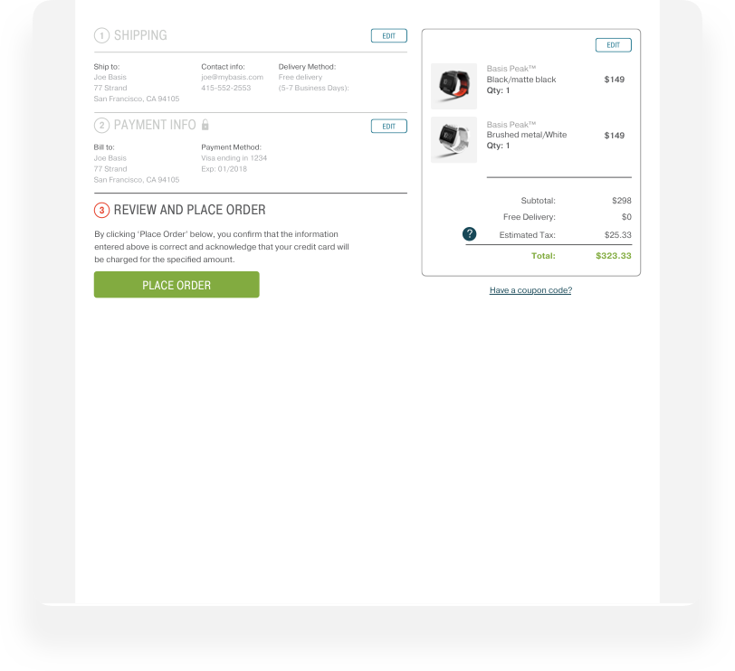
In order to solve the first issue, the long daunting form, I came up with the idea of dividing the form into 3 distinct sections (Shipping, billing, and confirmation). The three sections would open and collapse as a user progressed through the form. I then created a simple prototype to better visualize and share my solution. From there it was a matter of branding the flow and creating a style guide for devs.
Research.
I thought I only needed to work on a handful of pages, or why you should always conduct a site audit.
Finding color steps that work to
display values on heatmaps.
One of the first things I did after identifying the issues I needed to solve was to conduct a site audit. I wanted to get an exact idea of what the scope of this project was going to be. I naively thought that it would only be a few pages but after conducting the audit I realized that I had managed to neglect several scenarios such as errors, coupon codes and promos, and what to do in instances of suspected fraud. Conducting a site audit saved me several rounds of back and forth redesigning and solving issues that I thought I had solved.
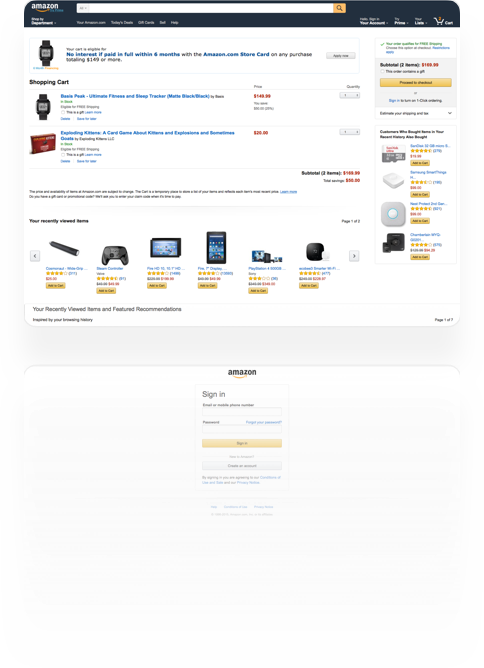
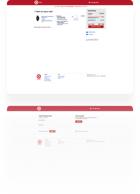
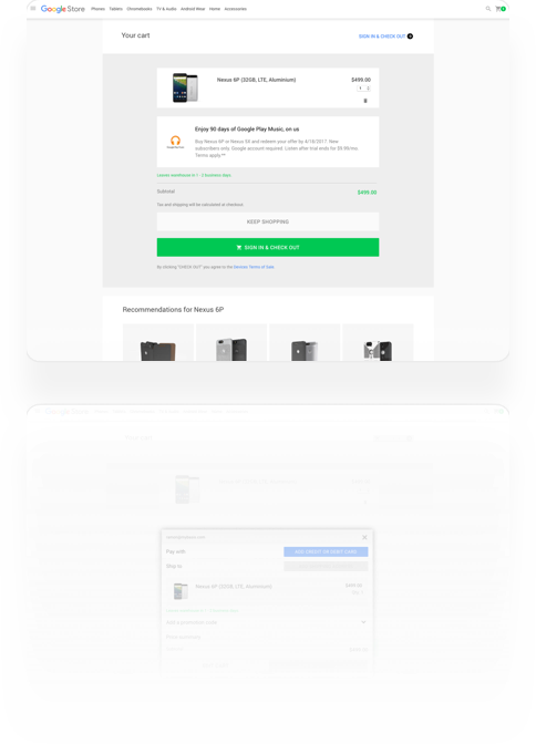
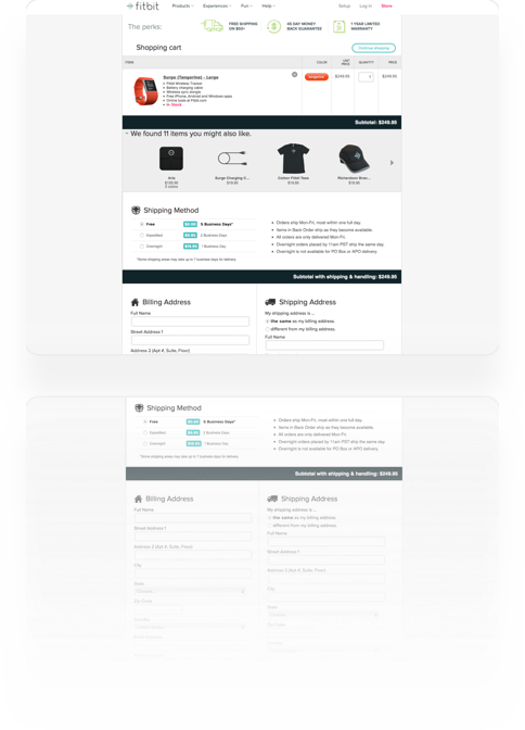
Checkout flows existed before I started on this project and will continue long after. That's why I looked at what others had done before me and conducted a competitive analysis. I took screenshots and documented the checkout flows of several competitors and consumer brands to gain a better understanding of what a good customer/user experience looks and feels like.
What else is out there?
Finding color steps that work to
display values on heatmaps.
What else is out there?
Wireframes.
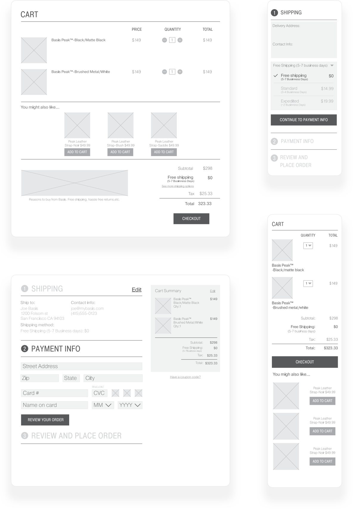
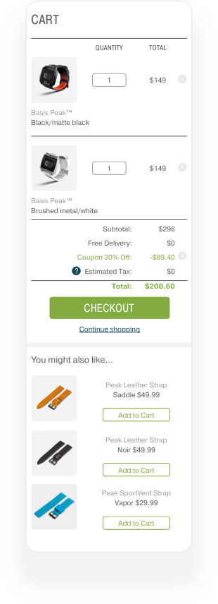
After reading and researching checkout flows enough, I was in a good place to start mapping out the flow and to begin wireframing. The mobile version of the flow seemed the most challenging so I started with that and then moved onto the desktop version. Doing it in this order saved me lots of time because I had to think more about how information should be organized.
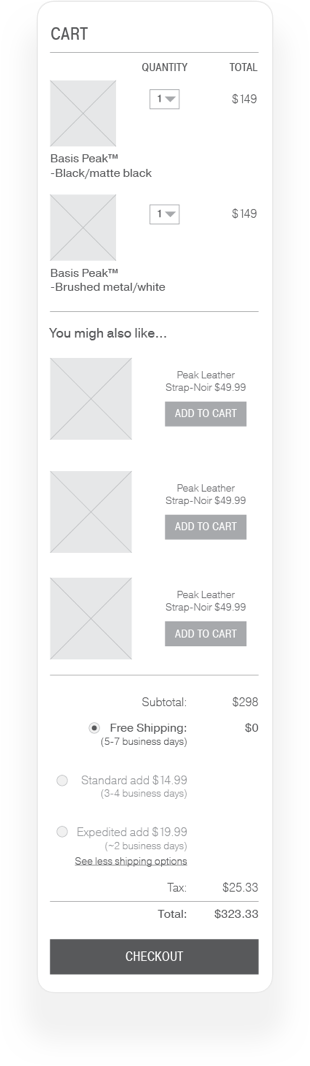
Mobile Wireframes
Mobile Wireframes
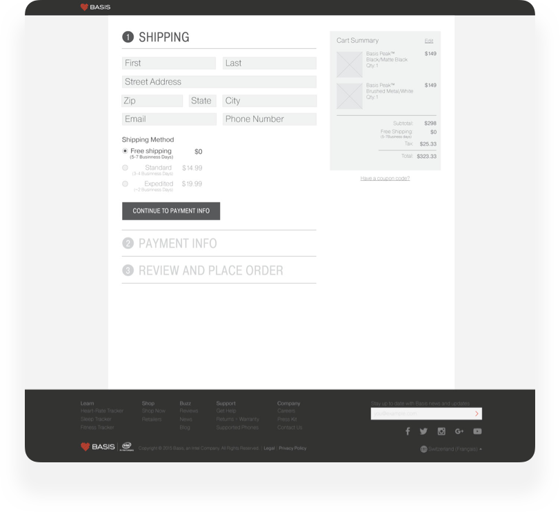
Starting on the mobile version first forced me to think more about the order in which information should be filled out on forms. For example, I placed the zip code box first instead of last so that we could use it to determine and auto-fill the city and state on the form saving users time and reducing friction.
Starting on the mobile version first forced me to think more about the order in which information should be filled out on forms. For example, I placed the zip code box first instead of last so that we could use it to determine and auto-fill the city and state on the form saving users time and reducing friction.
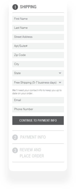
Desktop Wireframes
Desktop Wireframes
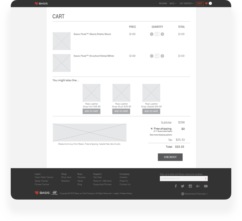
Another way I found to reduce friction in the checkout flow was to have a modified version of the main nav at the top once a user had progressed past the shopping cart. Removing links from the top removes distraction and users are less likely to navigate away from the site. Speaking of distractions, I also made the coupon link less prominent. Prominent coupon links increase cart abandonment on eCommerce sites since they can cause users to navigate to coupon sites or to a competitor's site.
Another way I found to reduce friction in the checkout flow was to have a modified version of the main nav at the top once a user had progressed past the shopping cart. Removing links from the top removes distraction and users are less likely to navigate away from the site. Speaking of distractions, I also made the coupon link less prominent. Prominent coupon links increase cart abandonment on eCommerce sites since they can cause users to navigate to coupon sites or to competitor's sites.
Mocks.
Style Guide.

Takeways.
Focus on mobile
By focusing on mobile first, I was forced to think about the information flow more critically. For example, choosing to have users fill out their zip code first so that we could then use that info to fill in their city and state. It also helped in forming the solution of having collapsible sections because of the constraints on vertical space.
Site audits and edge cases
Not sure why, but I never thought of how many edge cases are possible in a check out flow; I know better now. What started off as an exercise to document the many different steps in the checkout flow helped to put me into the right mindset of error codes, fraud, and coupon codes. All of which are edge cases that can make or break an experience for a prospective customer.