NETFLIX
Customer
Service Illustrations
Customer Service Illustrations
Intro.
Intro.
Role: Visual Designer | UX Designer | Prototyper | Animator
Team: Eunice Louie | Geoff House | Mika Yamaoka | Ramon Sandino
Tools: Figma | usertesting.com | After Effects
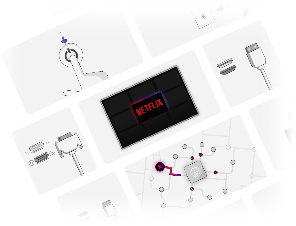
Netflix offers several ways for customers to reach out to contact customer service and to get help with issues or questions they might have. There are however, a large number of customers that prefer to try and resolve issues on their own before reaching out to customer service. As part of the Content Strategy team at Netflix, I worked on creating a set of visual assets and guidelines to help guide customers and customer service agents to solutions for their issues. The team consisted of myself, another visual designer, and a content editor. We had weekly critiques and shareouts with members of the customer health design team and bi-weekly shareouts with a broader team of stakeholders from the customer service organization. Although the catalyst for this project began as a small request for an illustration from an editor, it ended up becoming one of the larger projects I worked on.
Netflix offers several ways for customers to reach out to contact customer service and to get help with issues or questions they might have. There are however, a large number of customers that prefer to try and resolve issues on their own before reaching out to customer service. As part of the Content Strategy team at Netflix, I worked on creating a set of visual assets and guidelines to help guide customers and customer service agents to solutions for their issues. The team consisted of myself, another visual designer, and a content editor. We had weekly critiques and shareouts with members of the customer health design team and bi-weekly shareouts with a broader team of stakeholders from the customer service organization. Although the catalyst for this project began as a small request for an illustration from an editor, it ended up becoming one of the larger projects I worked on.
Netflix offers several ways for customers to reach out to contact customer service and to get help with issues or questions they might have. There are however, a large number of customers that prefer to try and resolve issues on their own before reaching out to customer service. As part of the Content Strategy team at Netflix, I worked on creating a set of visual assets and guidelines to help guide customers and customer service agents to solutions for their issues. The team consisted of myself, another visual designer, and a content editor. We had weekly critiques and shareouts with members of the customer health design team and bi-weekly shareouts with a broader team of stakeholders from the customer service organization. Although the catalyst for this project began as a small request for an illustration from an editor, it ended up becoming one of the larger projects I worked on.
Netflix offers several ways for customers to reach out to contact customer service and to get help with issues or questions they might have. There are however, a large number of customers that prefer to try and resolve issues on their own before reaching out to customer service. As part of the Content Strategy team at Netflix, I worked on creating a set of visual assets and guidelines to help guide customers and customer service agents to solutions for their issues. The team consisted of myself, another visual designer, and a content editor. We had weekly critiques and shareouts with members of the customer health design team and bi-weekly shareouts with a broader team of stakeholders from the customer service organization. Although the catalyst for this project began as a small request for an illustration from an editor, it ended up becoming one of the larger projects I worked on.
Problem.


The Netflix Help Center is full of information to help customers resolve their issues, but there’s a huge opportunity to leverage simple to follow visual instructions. While customer service agents have access to step-by-step visual guides, customers do not. Here are a few of the other problems that I was attempting to solve for:
- The visual guides use screen shots directly from the various apps so the content is not ever green and can be time consuming to maintain at scale.
- The visual assets aren’t localized. Netflix is available for streaming in ~190 countries and their customer service site supports roughly 30 languages.
- The visuals that do exist in the help center are outdated and lack a cohesive visual language.
- The visuals are all mostly static; some concepts could be better understood better if explained with animations.
- The illustrations used in product were too stylized to be used as visuals for step-by-step instructions in the help center. A different style of illustration was needed that was more functional and easier to understand.
Who is this for?
The two main audiences for this project were Netflix customers (those looking for self-service) and customer service agents. For Netflix customers, the main goal was to provide them with better resources and tools that could be used to self-serve and get them back to streaming faster. For customer service agents, our goal was to provide more up to date training materials, faster. By creating simple, cohesive, and scalable visual assets we could meet the needs of both of these audiences.
The two main audiences for this project were Netflix customers (those looking for self-service) and customer service agents. For Netflix customers, the main goal was to provide them with better resources and tools that could be used to self-serve and get them back to streaming faster. For customer service agents, our goal was to provide more up to date training materials, faster. By creating simple, cohesive, and scalable visual assets we could meet the needs of both of these audiences.
The two main audiences for this project were Netflix customers (those looking for self-service) and customer service agents. For Netflix customers, the main goal was to provide them with better resources and tools that could be used to self-serve and get them back to streaming faster. For customer service agents, our goal was to provide more up to date training materials, faster. By creating simple, cohesive, and scalable visual assets we could meet the needs of both of these audiences.
Goals
Simple
Simple
Simple
Simple
Simple
Create visuals that can be understood with a minimal need for text, better yet without text.
Create visuals that can be understood with a minimal need for text, better yet without text.
Create visuals that can be understood with a minimal need for text, better yet without text.
Scaleable
Scaleable
Scaleable
Scaleable
Scaleable
The style of the visuals should be easily reproducible and suitable for a variety of canvases and content.
The style of the visuals should be easily reproducible and suitable for a variety of canvases and content.
The style of the visuals should be easily reproducible and suitable for a variety of canvases and content.
Accessible
Accessible
Accessible
Accessible
Accessible
The visuals should be readable and legible to as many people as possible.
The visuals should be readable and legible to as many people as possible.
The visuals should be readable and legible to as many people as possible.
Research, Iterate, Repeat.
Research, Iterate, Repeat.
Observing customer service agents
Due to COVID restrictions, we weren’t able to go onsite to speak to customer service agents, but thanks to the magic of the internet, we were able to oberve and interview them remotely. The interviews took place over 4 days with 2 sessions each day. The groups consisted of about 5-6 agents each from different regions around the world (EMEA, APAC, LATAM, and UCAN) with tenure between 6 months to 2 years and were focused on the topic of visuals in the knowledge base.
Due to COVID restrictions, we weren’t able to go onsite to speak to customer service agents, but thanks to the magic of the internet, we were able to oberve and interview them remotely. The interviews took place over 4 days with 2 sessions each day. The groups consisted of about 5-6 agents each from different regions around the world (EMEA, APAC, LATAM, and UCAN) with tenure between 6 months to 2 years and were focused on the topic of visuals in the knowledge base.
Due to COVID restrictions, we weren’t able to go onsite to speak to customer service agents, but thanks to the magic of the internet, we were able to oberve and interview them remotely. The interviews took place over 4 days with 2 sessions each day. The groups consisted of about 5-6 agents each from different regions around the world (EMEA, APAC, LATAM, and UCAN) with tenure between 6 months to 2 years and were focused on the topic of visuals in the knowledge base.
Highlights from the interviews:
- The majority of agents (99%) agreed that adding more visuals to the knowledge base would be helpful to them when assisting a customer.
- Agents requested animated guides for topics that are more complicated.
- When asked what could be improved agents responded:
“I wish the visuals were more up to date. Some of them look really old”
“It would be nice if we could share these with customers so that they could better understand our instructions”.
Highlights from the interviews:
- The majority of agents (%99) agreed that adding more visuals to the knowledge base would be helpful to them when assisting a customer.
- Agents requested animated guides for topics that are more complicated.
- When asked what could be improved agents responded:
“I wish the visuals were more up to date. Some of them look really old”
“It would be nice if we could share these with customers so that they could better understand our instructions”.
Gathering inspiration and external examples
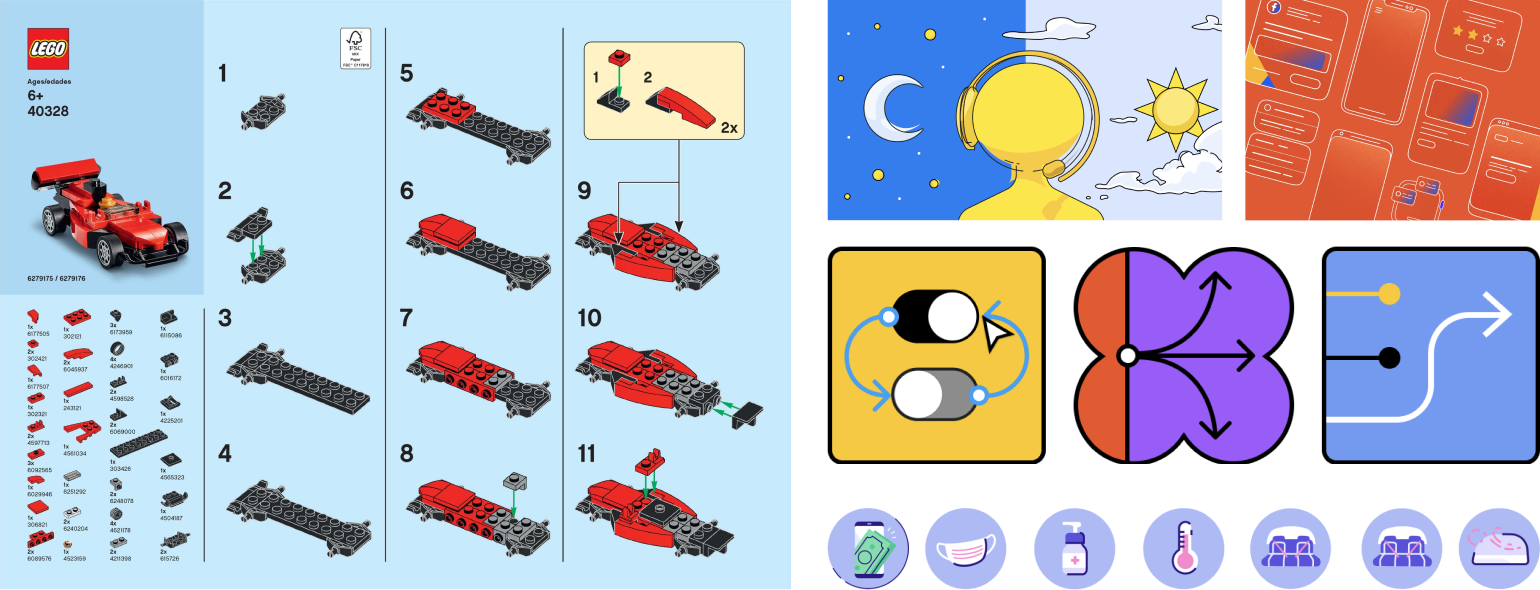
I had recently received a Lego set that I used for a team building exercise at work and had the Lego instructions fresh in my mind. What drew my attention was the fact that their instruction guide lacked nearly any words except for the logo. Using shapes, arrows, and numbers, they were able to create guides for some pretty complex objects.
I also keep a folder in my email of examples of visual design that I find useful or interesting so that was another place I went to look for inspiration. Their use of contrasting colors to draw focus, the use of outlines to clearly seperate objects from each other, and the playful yet functional style they all use were all elements I wanted to bring to the visuals for the help center.
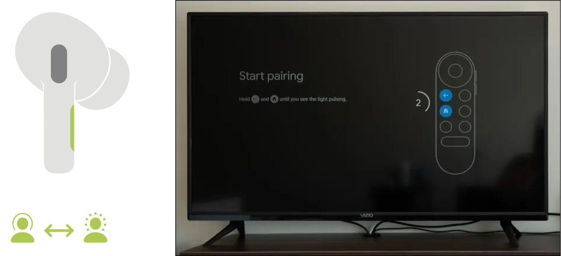
Other places I looked to for inspiration were from products that my friends and family use. I included these two examples because of their use of monotone values to form the overall shape of the objects but then use a bit of color to call attention to specific areas of focus.
Other places I looked to for inspiration were from products that my friends and family use. I included these two examples because of their use of monotone values to form the overall shape of the objects but then use a bit of color to call attention to specific areas of focus.
Other places I looked to for inspiration were from products that my friends and family use. I included these two examples because of their use of monotone values to form the overall shape of the objects but then use a bit of color to call attention to specific areas of focus.
First round
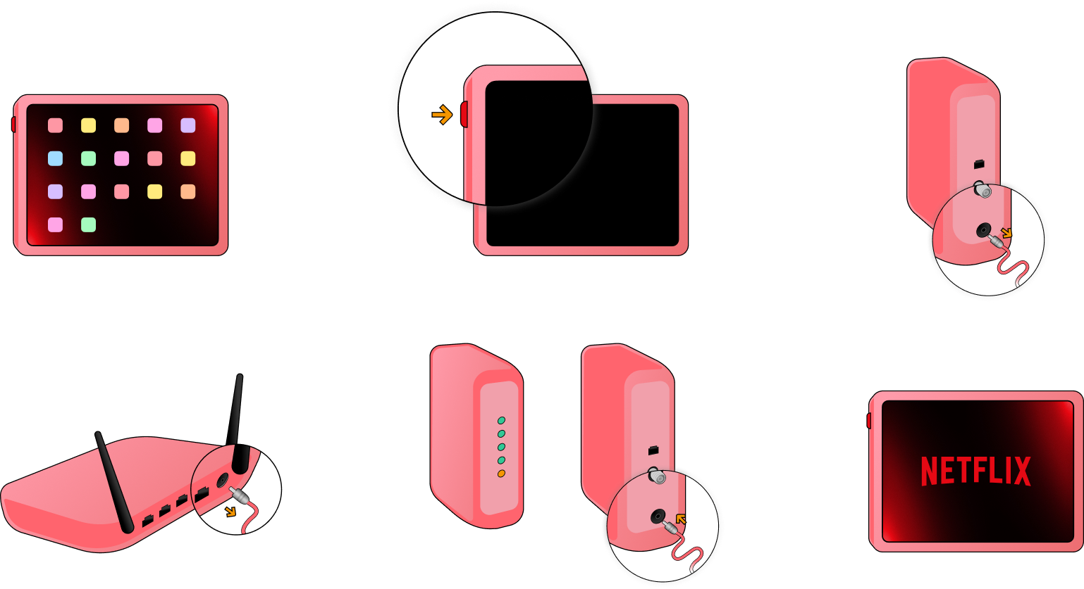
For the first round I wanted to incorporate some of the brand colors into the illustrations so I pulled a pale red value from the brand palette and used it as the base for the devices while using a darker red value to create some contrast and depth. I also used a black outline to better seperate the objects from themselves and the background. At this point I also started to experiment with how to draw focus and attention to different parts of the devices first by making the buttons the most saturated value of red, secondly by magnifying parts of the devices, and third by adding gold directional arrows.
For the first round I wanted to incorporate some of the brand colors into the illustrations so I pulled a pale red value from the brand palette and used it as the base for the devices while using a darker red value to create some contrast and depth. I also used a black outline to better seperate the objects from themselves and the background. At this point I also started to experiment with how to draw focus and attention to different parts of the devices first by making the buttons the most saturated value of red, secondly by magnifying parts of the devices, and third by adding gold directional arrows.
For the first round I wanted to incorporate some of the brand colors into the illustrations so I pulled a pale red value from the brand palette and used it as the base for the devices while using a darker red value to create some contrast and depth. I also used a black outline to better seperate the objects from themselves and the background. At this point I also started to experiment with how to draw focus and attention to different parts of the devices first by making the buttons the most saturated value of red, secondly by magnifying parts of the devices, and third by adding gold directional arrows.
For the first round I wanted to incorporate some of the brand colors into the illustrations so I pulled a pale red value from the brand palette and used it as the base for the devices while using a darker red value to create some contrast and depth. I also used a black outline to better seperate the objects from themselves and the background. At this point I also started to experiment with how to draw focus and attention to different parts of the devices first by making the buttons the most saturated value of red, secondly by magnifying parts of the devices, and third by adding gold directional arrows.
For the first round I wanted to incorporate some of the brand colors into the illustrations so I pulled a pale red value from the brand palette and used it as the base for the devices while using a darker red value to create some contrast and depth. I also used a black outline to better seperate the objects from themselves and the background. At this point I also started to experiment with how to draw focus and attention to different parts of the devices first by making the buttons the most saturated value of red, secondly by magnifying parts of the devices, and third by adding gold directional arrows.
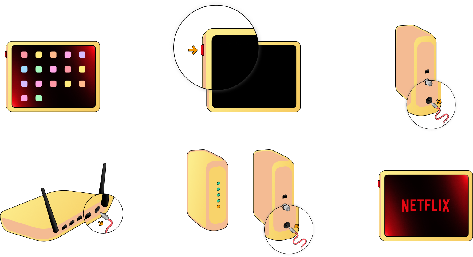
I then explored different colors and went with a pale yellow color value to experiment a bit but kept a red color for depth. Although the result was interesting, it felt too distracting.
I then explored different colors and went with a pale yellow color value to experiment a bit but kept a red color for depth. Although the result was interesting, it felt too distracting.
I then explored different colors and went with a pale yellow color value to experiment a bit but kept a red color for depth. Although the result was interesting, it felt too distracting.
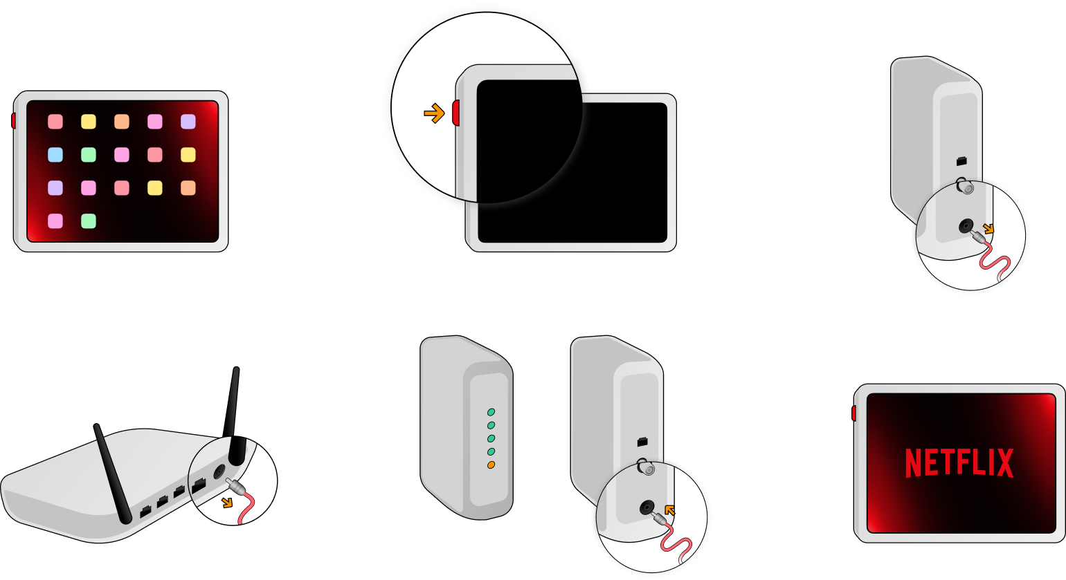
I also tried a gray scheme which worked out better than the other two I had tried. The more subdued tone helped to pull focus to the color accents on the buttons and directional arrows. The contrast between the gray and the black outlines also helped to better accentuate the shapes of the devices.
I also tried a gray scheme which worked out better than the other two I had tried. The more subdued tone helped to pull focus to the color accents on the buttons and directional arrows. The contrast between the gray and the black outlines also helped to better accentuate the shapes of the devices.
I also tried a gray scheme which worked out better than the other two I had tried. The more subdued tone helped to pull focus to the color accents on the buttons and directional arrows. The contrast between the gray and the black outlines also helped to better accentuate the shapes of the devices.
Feedback
- The yellow and red aren't working but the gray looks great.
- The magnified sections might confuse people. Is there a way to call attention to these areas some other way?
- What would these look like laid out in an article?
- The yellow and red aren't working but the gray looks great.
- The magnified sections might confuse people. Is there a way to calll attention to these areas some other way?
- What would these look like laid out in an article?
- The yellow and red aren't working but the gray looks great.
- The magnified sections might confuse people. Is there a way to calll attention to these areas some other way?
- What would these look like laid out in an article?
Second round
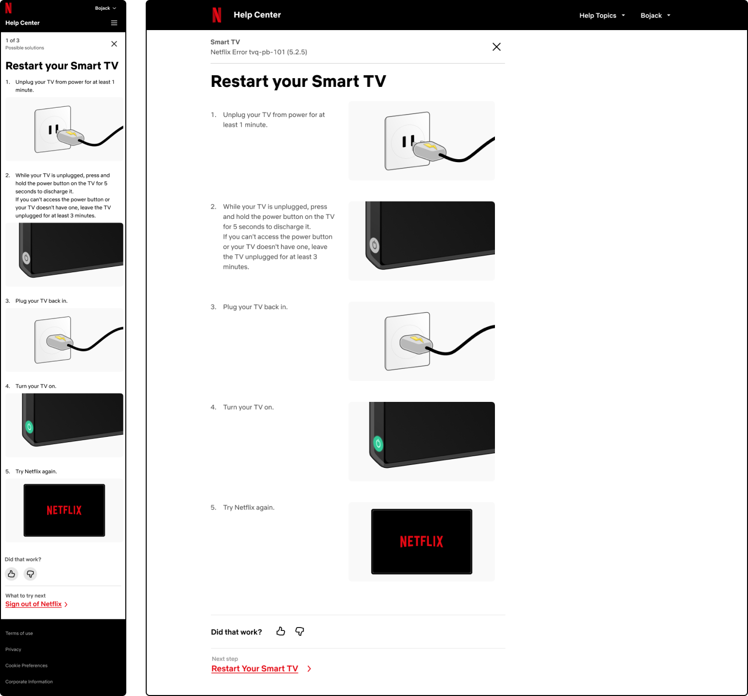
After sharing the last two rounds with the team, I thought it would be helpful show this next round in context so I put the illustrations into an article layout that a colleague was testing. This would also help me get a better sense of what they might look like on smaller screens and would also help me determine what changes we should make to article layouts in the future. I also further simplified the illustration style. The magnified sections were removed and I instead zoomed in on certain parts of the devices.
After sharing the last two rounds with the team, I thought it would be helpful show this next round in context so I put the illustrations into an article layout that a colleague was testing. This would also help me get a better sense of what they might look like on smaller screens and would also help me determine what changes we should make to article layouts in the future. I also further simplified the illustration style. The magnified sections were removed and I instead zoomed in on certain parts of the devices.
After sharing the last two rounds with the team, I thought it would be helpful show this next round in context so I put the illustrations into an article layout that a colleague was testing. This would also help me get a better sense of what they might look like on smaller screens and would also help me determine what changes we should make to article layouts in the future. I also further simplified the illustration style. The magnified sections were removed and I instead zoomed in on certain parts of the devices.
After sharing the last two rounds with the team, I thought it would be helpful show this next round in context so I put the illustrations into an article layout that a colleague was testing. This would also help me get a better sense of what they might look like on smaller screens and would also help me determine what changes we should make to article layouts in the future. I also further simplified the illustration style. The magnified sections were removed and I instead zoomed in on certain parts of the devices.
Feedback
- The zoomed in devices lose context.
- The plugs might be too North American centric.
- The directional arrows from the previous versions would be helpful to highlight actions.
- The zoomed in devices lose context.
- The plugs might be too North American centric.
- The directional arrows from the previous versions would be helpful to highlight actions.
- The zoomed in devices lose context.
- The plugs might be too North American centric.
- The directional arrows from the previous versions would be helpful to highlight actions.
- The zoomed in devices lose context.
- The plugs might be too North American centric.
- The directional arrows from the previous versions would be helpful to highlight actions.
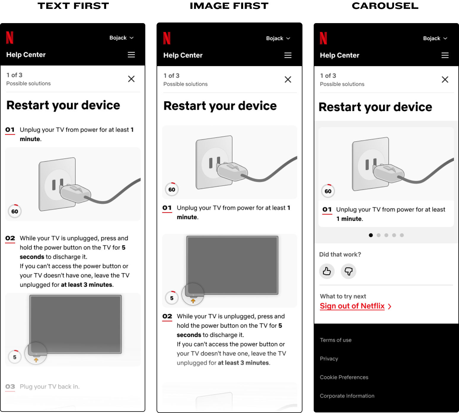
Exploring and testing new layouts
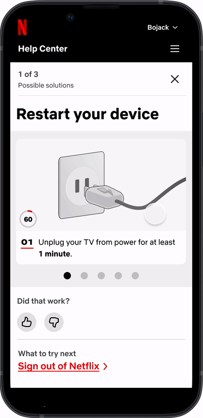
Now that I had a general idea for the direction of the illustration style I began to think of different layouts and other visual elements to use in the articles to help support the visuals. The focus of these explorations was on mobile layouts since mobile devices account for roughly 70% of the traffic of the help center. I then tested these layouts in a small test (10 people) on usertesting.com to get an idea of how users might react to them and to the illustrations.
Now that I had a general idea for the direction of the illustration style I began to think of different layouts and other visual elements to use in the articles to help support the visuals. The focus of these explorations was on mobile layouts since mobile devices account for roughly 70% of the traffic of the help center. I then tested these layouts in a small test (10 people) on usertesting.com to get an idea of how users might react to them and to the illustrations.
Now that I had a general idea for the direction of the illustration style I began to think of different layouts and other visual elements to use in the articles to help support the visuals. The focus of these explorations was on mobile layouts since mobile devices account for roughly 70% of the traffic of the help center. I then tested these layouts in a small test (10 people) on usertesting.com to get an idea of how users might react to them and to the illustrations.
Now that I had a general idea for the direction of the illustration style I began to think of different layouts and other visual elements to use in the articles to help support the visuals. The focus of these explorations was on mobile layouts since mobile devices account for roughly 70% of the traffic of the help center. I then tested these layouts in a small test (10 people) on usertesting.com to get an idea of how users might react to them and to the illustrations.
Now that I had a general idea for the direction of the illustration style I began to think of different layouts and other visual elements to use in the articles to help support the visuals. The focus of these explorations was on mobile layouts since mobile devices account for roughly 70% of the traffic of the help center. I then tested these layouts in a small test (10 people) on usertesting.com to get an idea of how users might react to them and to the illustrations.
Visual elements
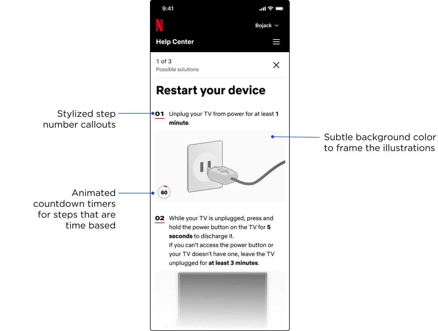
Layout Options
Carousel Interaction
Findings from testing
Overall, the feedback for the illustrations was positive. 80% of the users rated the illustrations as “very helpful” in troubleshooting on a scale of 1 to 7, where 1 is “not helpful” and 7 is “very helpful”. Of those who did not rate them “very helpful”, the useers commented that the illustrations might be unnecessary for this specific scenario.
As for the layouts, the consensus was that the text first layout made the most sense to people since the images served as natural break points for each step. A few users commented that the step numbers where a bit too prominent and that the animated counters made them feel a little anxious because they didn’t know what to expect once it reached zero. Out of the three layouts the carousel was the lowest rated since it didn’t allow for users to easily see the next steps without having to interact with the page and a few users didn’t realize they could swipe left and right on the cards.
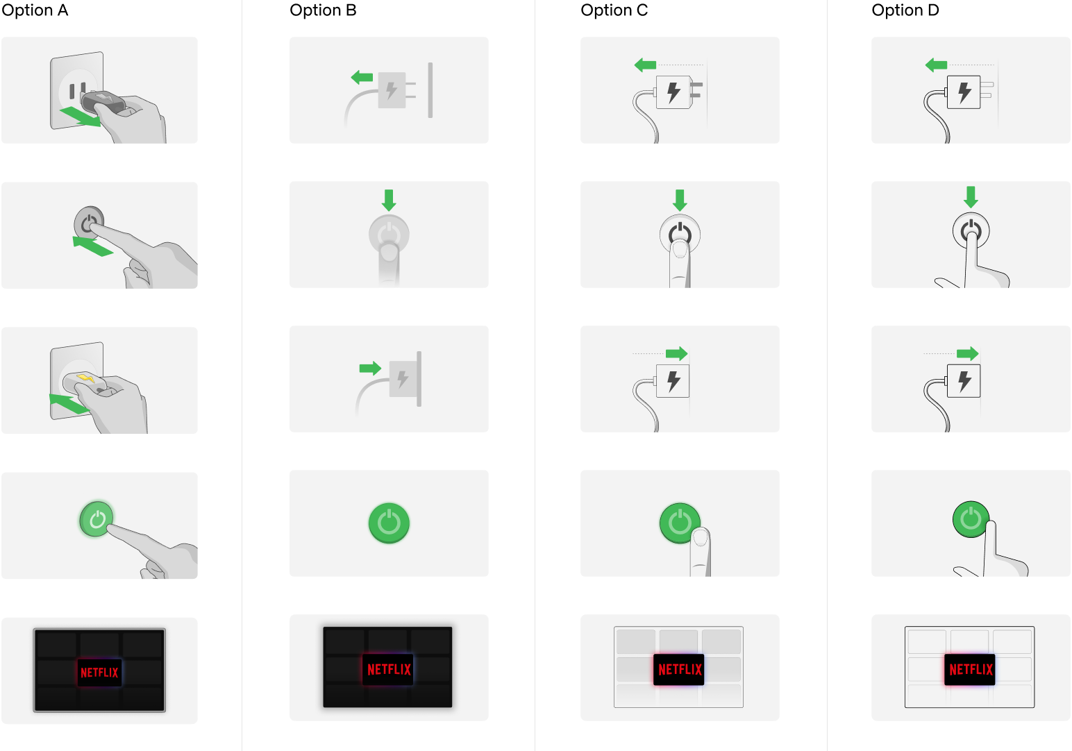
One last round of iterations
Before committing to and making a final decision on the illustration style, I tried a few more styles. I took a look at the feedback that I had gathered from the past rounds and from the user testing and intergrated the bits that made sense. I experimented with different viewing angles, adding elements such as hands and directional arrows, and simplified objects as much as possible.
Before committing to and making a final decision on the illustration style, I tried a few more styles. I took a look at the feedback that I had gathered from the past rounds and from the user testing and intergrated the bits that made sense. I experimented with different viewing angles, adding elements such as hands and directional arrows, and simplified objects as much as possible.
Before committing to and making a final decision on the illustration style, I tried a few more styles. I took a look at the feedback that I had gathered from the past rounds and from the user testing and intergrated the bits that made sense. I experimented with different viewing angles, adding elements such as hands and directional arrows, and simplified objects as much as possible.
Before committing to and making a final decision on the illustration style, I tried a few more styles. I took a look at the feedback that I had gathered from the past rounds and from the user testing and intergrated the bits that made sense. I experimented with different viewing angles, adding elements such as hands and directional arrows, and simplified objects as much as possible.
Before committing to and making a final decision on the illustration style, I tried a few more styles. I took a look at the feedback that I had gathered from the past rounds and from the user testing and intergrated the bits that made sense. I experimented with different viewing angles, adding elements such as hands and directional arrows, and simplified objects as much as possible.
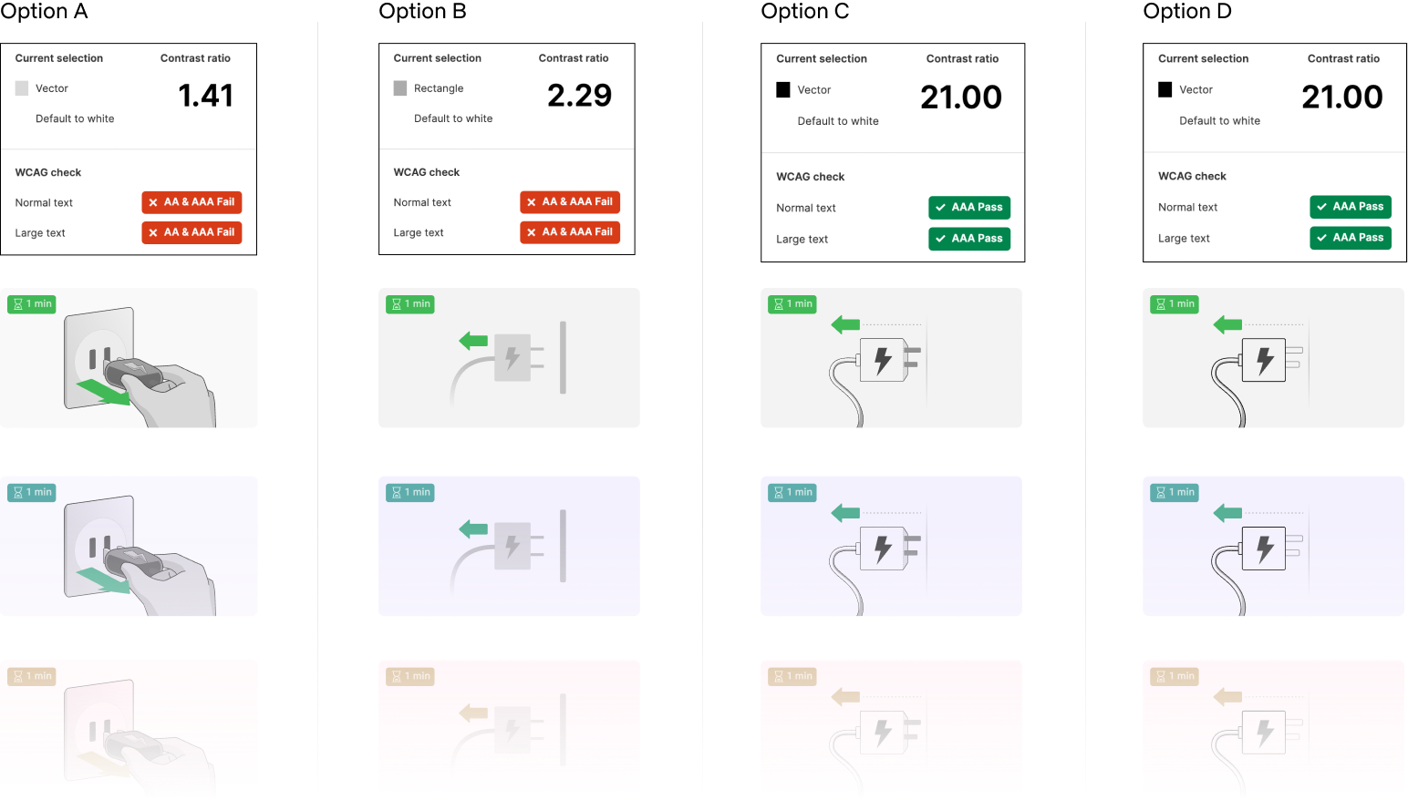
Checking color contrast
Accessibility was one of the goals I set out to achieve at the outset so I used a color contrast checker Figma plugin called Color contrast to see how the different options held up. Options A and B completely failed the check at 1.41:1 and 2.29:1 contrast ratios while C and D both scored really well at a 21:1 contrast ratio. Although options C and D were similar to each other I preferred the simplicity of the shapes in option D so that was the one I decided to move forward with.
Accessibility was one of the goals I set out to achieve at the outset so I used a color contrast checker Figma plugin called Color contrast to see how the different options held up. Options A and B completely failed the check at 1.41:1 and 2.29:1 contrast ratios while C and D both scored really well at a 21:1 contrast ratio. Although options C and D were similar to each other I preferred the simplicity of the shapes in option D so that was the one I decided to move forward with.
Accessibility was one of the goals I set out to achieve at the outset so I used a color contrast checker Figma plugin called Color contrast to see how the different options held up. Options A and B completely failed the check at 1.41:1 and 2.29:1 contrast ratios while C and D both scored really well at a 21:1 contrast ratio. Although options C and D were similar to each other I preferred the simplicity of the shapes in option D so that was the one I decided to move forward with.
Accessibility was one of the goals I set out to achieve at the outset so I used a color contrast checker Figma plugin called Color contrast to see how the different options held up. Options A and B completely failed the check at 1.41:1 and 2.29:1 contrast ratios while C and D both scored really well at a 21:1 contrast ratio. Although options C and D were similar to each other I preferred the simplicity of the shapes in option D so that was the one I decided to move forward with.
Solution.
The solution I arrived at was based off the culmination of the feedback I had gathered from observations, critique sessions, and testing. The end result achieved the goals I had set out at the beginning of visual assets that are simple, scalable, and accessible.
The solution I arrived at was based off the culmination of the feedback I had gathered from observations, critique sessions, and testing. The end result achieved the goals I had set out at the beginning of visual assets that are simple, scalable, and accessible.
The solution I arrived at was based off the culmination of the feedback I had gathered from observations, critique sessions, and testing. The end result achieved the goals I had set out at the beginning of visual assets that are simple, scalable, and accessible.
The solution I arrived at was based off the culmination of the feedback I had gathered from observations, critique sessions, and testing. The end result achieved the goals I had set out at the beginning of visual assets that are simple, scalable, and accessible.
The solution I arrived at was based off the culmination of the feedback I had gathered from observations, critique sessions, and testing. The end result achieved the goals I had set out at the beginning of visual assets that are simple, scalable, and accessible.
General styling
Below are some of the general guidelines for the illustrations that can be used as a basis to expand the library. These are not meant to serve as hard rules that must be followed but as a starting point with best practices that can be adapted to different use cases and situations.
Below are some of the general guidelines for the illustrations that can be used as a basis to expand the library. These are not meant to serve as hard rules that must be followed but as a starting point with best practices that can be adapted to different use cases and situations.
Below are some of the general guidelines for the illustrations that can be used as a basis to expand the library. These are not meant to serve as hard rules that must be followed but as a starting point with best practices that can be adapted to different use cases and situations.
Below are some of the general guidelines for the illustrations that can be used as a basis to expand the library. These are not meant to serve as hard rules that must be followed but as a starting point with best practices that can be adapted to different use cases and situations.
Below are some of the general guidelines for the illustrations that can be used as a basis to expand the library. These are not meant to serve as hard rules that must be followed but as a starting point with best practices that can be adapted to different use cases and situations.
Color Palette
The colors used in the palette were chosen to ensure good contrast and to provide a sense of depth while keeping the overall objects and shapes as simple as possible. Hints of color are used to highlight actions and to attract focus.
The colors used in the palette were chosen to ensure good contrast and to provide a sense of depth while keeping the overall objects and shapes as simple as possible. Hints of color are used to highlight actions and to attract focus.
The colors used in the palette were chosen to ensure good contrast and to provide a sense of depth while keeping the overall objects and shapes as simple as possible. Hints of color are used to highlight actions and to attract focus.
The colors used in the palette were chosen to ensure good contrast and to provide a sense of depth while keeping the overall objects and shapes as simple as possible. Hints of color are used to highlight actions and to attract focus.
The colors used in the palette were chosen to ensure good contrast and to provide a sense of depth while keeping the overall objects and shapes as simple as possible. Hints of color are used to highlight actions and to attract focus.

Strokes

To ensure consistency for main elements, a 1px stroke width should be used for all stroked elements in the illustrations. If necessary for smaller elements, a .25px stroke can also be used. Rounded caps should be used as much as necessary but there may be situations where a feathered cap my be more suitable. Corners should be rounded and the stroke color for main elements should always be #000000.
To ensure consistency for main elements, a 1px stroke width should be used for all stroked elements in the illustrations. If necessary for smaller elements, a .25px stroke can also be used. Rounded caps should be used as much as necessary but there may be situations where a feathered cap my be more suitable. Corners should be rounded and the stroke color for main elements should always be #000000.
To ensure consistency for main elements, a 1px stroke width should be used for all stroked elements in the illustrations. If necessary for smaller elements, a .25px stroke can also be used. Rounded caps should be used as much as necessary but there may be situations where a feathered cap my be more suitable. Corners should be rounded and the stroke color for main elements should always be #000000.
To ensure consistency for main elements, a 1px stroke width should be used for all stroked elements in the illustrations. If necessary for smaller elements, a .25px stroke can also be used. Rounded caps should be used as much as necessary but there may be situations where a feathered cap my be more suitable. Corners should be rounded and the stroke color for main elements should always be #000000.
To ensure consistency for main elements, a 1px stroke width should be used for all stroked elements in the illustrations. If necessary for smaller elements, a .25px stroke can also be used. Rounded caps should be used as much as necessary but there may be situations where a feathered cap my be more suitable. Corners should be rounded and the stroke color for main elements should always be #000000.

For secondary elements, the stroke color should be changed to 40% Black (#999999).
For secondary elements, the stroke color should be changed to 40% Black (#999999).
For secondary elements, the stroke color should be changed to 40% Black (#999999).

Dashed strokes shoud be used in conjunction with directional arrows to imply movement. The direction gradient (#3E1842, #4969E4) should be used with a dash size of 1px and a gap of 4px, the caps should also be set to round. A 2px size can be used for this type of stroke if necessary but make sure to adjust the dash settings to a dash size of 2px with a gap of 8px.
Dashed strokes shoud be used in conjunction with directional arrows to imply movement. The direction gradient (#3E1842, #4969E4) should be used with a dash size of 1px and a gap of 4px, the caps should also be set to round. A 2px size can be used for this type of stroke if necessary but make sure to adjust the dash settings to a dash size of 2px with a gap of 8px.
Dashed strokes shoud be used in conjunction with directional arrows to imply movement. The direction gradient (#3E1842, #4969E4) should be used with a dash size of 1px and a gap of 4px, the caps should also be set to round. A 2px size can be used for this type of stroke if necessary but make sure to adjust the dash settings to a dash size of 2px with a gap of 8px.
Dashed strokes shoud be used in conjunction with directional arrows to imply movement. The direction gradient (#3E1842, #4969E4) should be used with a dash size of 1px and a gap of 4px, the caps should also be set to round. A 2px size can be used for this type of stroke if necessary but make sure to adjust the dash settings to a dash size of 2px with a gap of 8px.
Dashed strokes shoud be used in conjunction with directional arrows to imply movement. The direction gradient (#3E1842, #4969E4) should be used with a dash size of 1px and a gap of 4px, the caps should also be set to round. A 2px size can be used for this type of stroke if necessary but make sure to adjust the dash settings to a dash size of 2px with a gap of 8px.
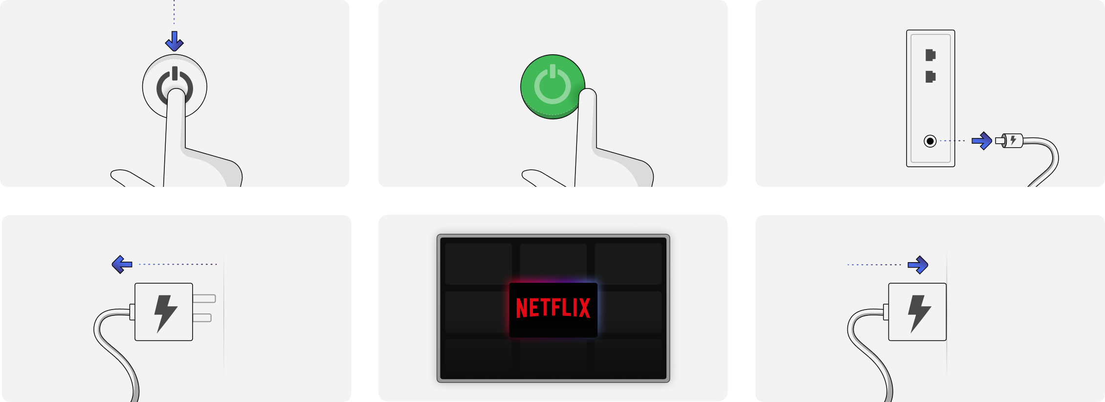
Elements Breakdown
Elements Breakdown


Animated Examples


Testing my solution
With the proposed solution in hand, it was time to test it to make sure it was suitable for our needs. Together with my manager, we broke down the goals for the research and what we wanted to gain insights into.
- Help us gain insight into how users feel about troubleshooting articles that contain illustrations vs. articles that don’t
- Help us determine the best use cases for visuals and what article types would benefit most from having them included. 3 use cases/article types:
Troubleshooting | Explaining Concepts | How-to’s
- Gather feedback on the illustrations themselves: how clear are they? Feelings about the style of illustration, are illustrations needed for every step?
With the proposed solution in hand, it was time to test it to make sure it was suitable for our needs. Together with my manager, we broke down the goals for the research and what we wanted to gain insights into.
- Help us gain insight into how users feel about troubleshooting articles that contain illustrations vs. articles that don’t
- Help us determine use cases for visuals and what article types would benefit most from having them included. 3 use cases/article types:
Troubleshooting | Explaining Concepts | How-to’s
- Gather feedback on the illustrations themselves: how clear are they? Feelings about the style of illustration, are illustrations needed for every step?
Testing plan
I once again turned to usertesting.com for testing, this time with help from one of my colleagues from our customer insights team. She helped validate my testing plan, offered a lot of useful suggestions, and helped me setup my tests.
I once again turned to usertesting.com for testing, this time with help from one of my colleagues from our customer insights team. She helped validate my testing plan, offered a lot of useful suggestions, and helped me setup my tests.
I once again turned to usertesting.com for testing, this time with help from one of my colleagues from our customer insights team. She helped validate my testing plan, offered a lot of useful suggestions, and helped me setup my tests.
I once again turned to usertesting.com for testing, this time with help from one of my colleagues from our customer insights team. She helped validate my testing plan, offered a lot of useful suggestions, and helped me setup my tests.
I once again turned to usertesting.com for testing, this time with help from one of my colleagues from our customer insights team. She helped validate my testing plan, offered a lot of useful suggestions, and helped me setup my tests.


Participants were assigned to one of 6 groups where 3 groups were shown articles with visuals and 3 groups were shown text only articles (control group). They were each given a scenario based off of 1 of the 3 uses cases we were testing for; troubleshooting, explaining concepts, and how-to’s. They were then asked to answer a series of questions based on the content of the articles and related to the following themes:
Effort
Does the inclusion of visuals/illustrations make the task easier to complete?
SAMPLE QUESTION:
SAMPLE QUESTION:
“How easy or difficult is it to understand the steps listed in this article?”
(7-point Rating Scale: 1=very difficult, 7=very easy)
“How easy or difficult is it to understand the steps listed in this article?”
(7-point Rating Scale: 1=very difficult, 7=very easy)
“How easy or difficult is it to understand the steps listed in this article?”
(7-point Rating Scale: 1=very difficult, 7=very easy)
“How easy or difficult is it to understand the steps listed in this article?”
(7-point Rating Scale: 1=very difficult, 7=very easy)
“How easy or difficult is it to understand the steps listed in this article?”
(7-point Rating Scale: 1=very difficult, 7=very easy)
Helpfulness
Does having visuals/illustrations in an article help participants understand the content better?
Helpfulness
Does having visuals/illustrations in an article help participants understand the content better?
Helpfulness
Does having visuals/illustrations in an article help participants understand the content better?
Helpfulness
Does having visuals/illustrations in an article help participants understand the content better?
Helpfulness
Does having visuals/illustrations in an article help participants understand the content better?
SAMPLE QUESTION:
“What are the 3 steps that are recommended to fix the error?”
“What are the 3 steps that are recommended to fix the error?”
“What are the 3 steps that are recommended to fix the error?”
“What are the 3 steps that are recommended to fix the error?”
“What are the 3 steps that are recommended to fix the error?”
Contact Rate
Do articles with visuals/illustrations make participants more or less likely to contact customer service?
Contact Rate
Do articles with visuals/illustrations make participants more or less likely to contact customer service?
Contact Rate
Do articles with visuals/illustrations make participants more or less likely to contact customer service?
Contact Rate
Do articles with visuals/illustrations make participants more or less likely to contact customer service?
Contact Rate
Do articles with visuals/illustrations make participants more or less likely to contact customer service?
SAMPLE QUESTION:
"After seeing this article, how likely are you to contact customer service?"
(7-point Rating Scale: 1=not likely at all, 7=very likely)
"After seeing this article, how likely are you to contact customer service?"
(7-point Rating Scale: 1=not likely at all, 7=very likely)
"After seeing this article, how likely are you to contact customer service?"
(7-point Rating Scale: 1=not likely at all, 7=very likely)
"After seeing this article, how likely are you to contact customer service?"
(7-point Rating Scale: 1=not likely at all, 7=very likely)
"After seeing this article, how likely are you to contact customer service?"
(7-point Rating Scale: 1=not likely at all, 7=very likely)
For the purposes of this testing, success would be achieved if the groups with visuals scored the same or better than the control group(text only) in the categories above.
For the purposes of this testing, success would be achieved if the groups with visuals scored the same or better than the control group(text only) in the categories above.
For the purposes of this testing, success would be achieved if the groups with visuals scored the same or better than the control group(text only) in the categories above.
For the purposes of this testing, success would be achieved if the groups with visuals scored the same or better than the control group(text only) in the categories above.
For the purposes of this testing, success would be achieved if the groups with visuals scored the same or better than the control group(text only) in the categories above.
Findings for 'troubleshooting' articles
Findings for 'troubleshooting' articles
The results for troubleshooting articles were pretty flat within the the 3 themes of effort, helpfulness, and contact rate. The biggest difference was in the helpfulness category where only 40% of participants in the text only group were able to list the correct troubleshooting steps.
The results for troubleshooting articles were pretty flat within the the 3 themes of effort, helpfulness, and contact rate. The biggest difference was in the helpfulness category where only 40% of participants in the text only group were able to list the correct troubleshooting steps.
The results for troubleshooting articles were pretty flat within the the 3 themes of effort, helpfulness, and contact rate. The biggest difference was in the helpfulness category where only 40% of participants in the text only group were able to list the correct troubleshooting steps.
The results for troubleshooting articles were pretty flat within the the 3 themes of effort, helpfulness, and contact rate. The biggest difference was in the helpfulness category where only 40% of participants in the text only group were able to list the correct troubleshooting steps.
The results for troubleshooting articles were pretty flat within the the 3 themes of effort, helpfulness, and contact rate. The biggest difference was in the helpfulness category where only 40% of participants in the text only group were able to list the correct troubleshooting steps.
Troubleshooting (with visuals)
Troubleshooting (text only)
Effort
Sample question
“How easy or difficult is it to understand the steps listed in this article?”
(7-point Rating Scale: 1=very difficult, 7=very easy)
“How easy or difficult is it to understand the steps listed in this article?”
(7-point Rating Scale: 1=very difficult, 7=very easy)
“How easy or difficult is it to understand the steps listed in this article?”
(7-point Rating Scale: 1=very difficult, 7=very easy)
“How easy or difficult is it to understand the steps listed in this article?”
(7-point Rating Scale: 1=very difficult, 7=very easy)
“How easy or difficult is it to understand the steps listed in this article?”
(7-point Rating Scale: 1=very difficult, 7=very easy)

Helpfulness
Sample question
“What are the 3 steps that are recommended to fix the error?”
Percentage of participants that aswered questions correctly
“What are the 3 steps that are recommended to fix the error?”
Percentage of participants that aswered questions correctly
“What are the 3 steps that are recommended to fix the error?”
Percentage of participants that aswered questions correctly
“What are the 3 steps that are recommended to fix the error?”
Percentage of participants that aswered questions correctly
“What are the 3 steps that are recommended to fix the error?”
Percentage of participants that aswered questions correctly

Contact Rate
Sample question
“After seeing this article, how likely are you to contact customer service?”
(7-point Rating Scale: 1=not likely at all, 7=very likely)
“After seeing this article, how likely are you to contact customer service?”
(7-point Rating Scale: 1=not likely at all, 7=very likely)
“After seeing this article, how likely are you to contact customer service?”
(7-point Rating Scale: 1=not likely at all, 7=very likely)
“After seeing this article, how likely are you to contact customer service?”
(7-point Rating Scale: 1=not likely at all, 7=very likely)
“After seeing this article, how likely are you to contact customer service?”
(7-point Rating Scale: 1=not likely at all, 7=very likely)

Comments
“Choose 3 words to describe the visuals used in this article.”
“Choose 3 words to describe the visuals used in this article.”
“Choose 3 words to describe the visuals used in this article.”
“Choose 3 words to describe the visuals used in this article.”
“Choose 3 words to describe the visuals used in this article.”
“The visuals are easy to understand and support the information given, which can help older customers, as well as younger ones who are less familiar with technologies. ”
“The visuals are easy to understand and support the information given, which can help older customers, as well as younger ones who are less familiar with technologies. ”
“The visuals are easy to understand and support the information given, which can help older customers, as well as younger ones who are less familiar with technologies. ”
“The visuals are easy to understand and support the information given, which can help older customers, as well as younger ones who are less familiar with technologies. ”
“The visuals are easy to understand and support the information given, which can help older customers, as well as younger ones who are less familiar with technologies. ”
“Simple, easy, logical. These are all basic symbols/drawings that make it easy to tell what the drawing is of and it makes sense if I did not have instructions on the basics of what I need to do.”
“Simple, easy, logical. These are all basic symbols/drawings that make it easy to tell what the drawing is of and it makes sense if I did not have instructions on the basics of what I need to do.”
“Simple, easy, logical. These are all basic symbols/drawings that make it easy to tell what the drawing is of and it makes sense if I did not have instructions on the basics of what I need to do.”
“Simple, easy, logical. These are all basic symbols/drawings that make it easy to tell what the drawing is of and it makes sense if I did not have instructions on the basics of what I need to do.”
“Simple, easy, logical. These are all basic symbols/drawings that make it easy to tell what the drawing is of and it makes sense if I did not have instructions on the basics of what I need to do.”
“clean straight foward and practical ”
“clean straight foward and practical ”
“clean straight foward and practical ”
“clean straight foward and practical ”
“clean straight foward and practical ”
Findings for 'explaining concepts' articles
Findings for 'explaining concepts' articles
Findings for 'explaining concepts' articles
Once again, the results here were pretty flat. The biggest difference was in the helpfulness category where only 40% of participants in the text only group were able to answer the question correctly.
Once again, the results here were pretty flat. The biggest difference was in the helpfulness category where only 40% of participants in the text only group were able to answer the question correctly.
Once again, the results here were pretty flat. The biggest difference was in the helpfulness category where only 40% of participants in the text only group were able to answer the question correctly.
Once again, the results here were pretty flat. The biggest difference was in the helpfulness category where only 40% of participants in the text only group were able to answer the question correctly.
Once again, the results here were pretty flat. The biggest difference was in the helpfulness category where only 40% of participants in the text only group were able to answer the question correctly.
Explaining concepts (with visuals)
Explaining concepts (text only)
Effort
Sample question
“How easy was it to understand the concept of how streaming works?”
(7-point Rating Scale: 1=very difficult, 7=very easy)
“How easy was it to understand the concept of how streaming works?”
(7-point Rating Scale: 1=very difficult, 7=very easy)
“How easy was it to understand the concept of how streaming works?”
(7-point Rating Scale: 1=very difficult, 7=very easy)
“How easy was it to understand the concept of how streaming works?”
(7-point Rating Scale: 1=very difficult, 7=very easy)
“How easy was it to understand the concept of how streaming works?”
(7-point Rating Scale: 1=very difficult, 7=very easy)

Helpfulness
Sample question
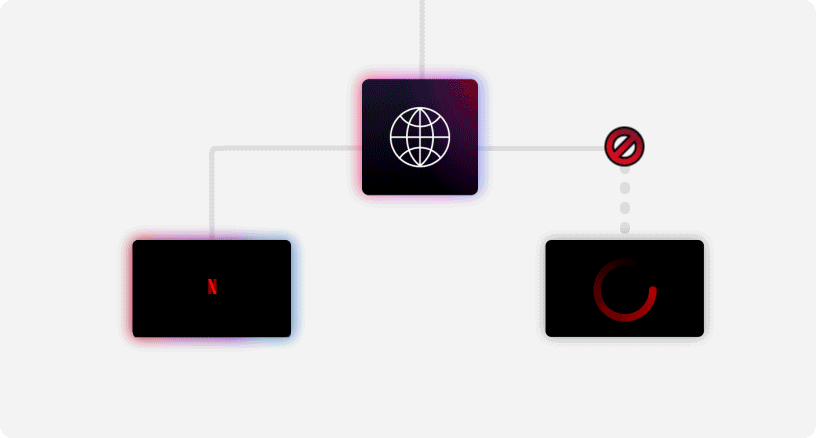
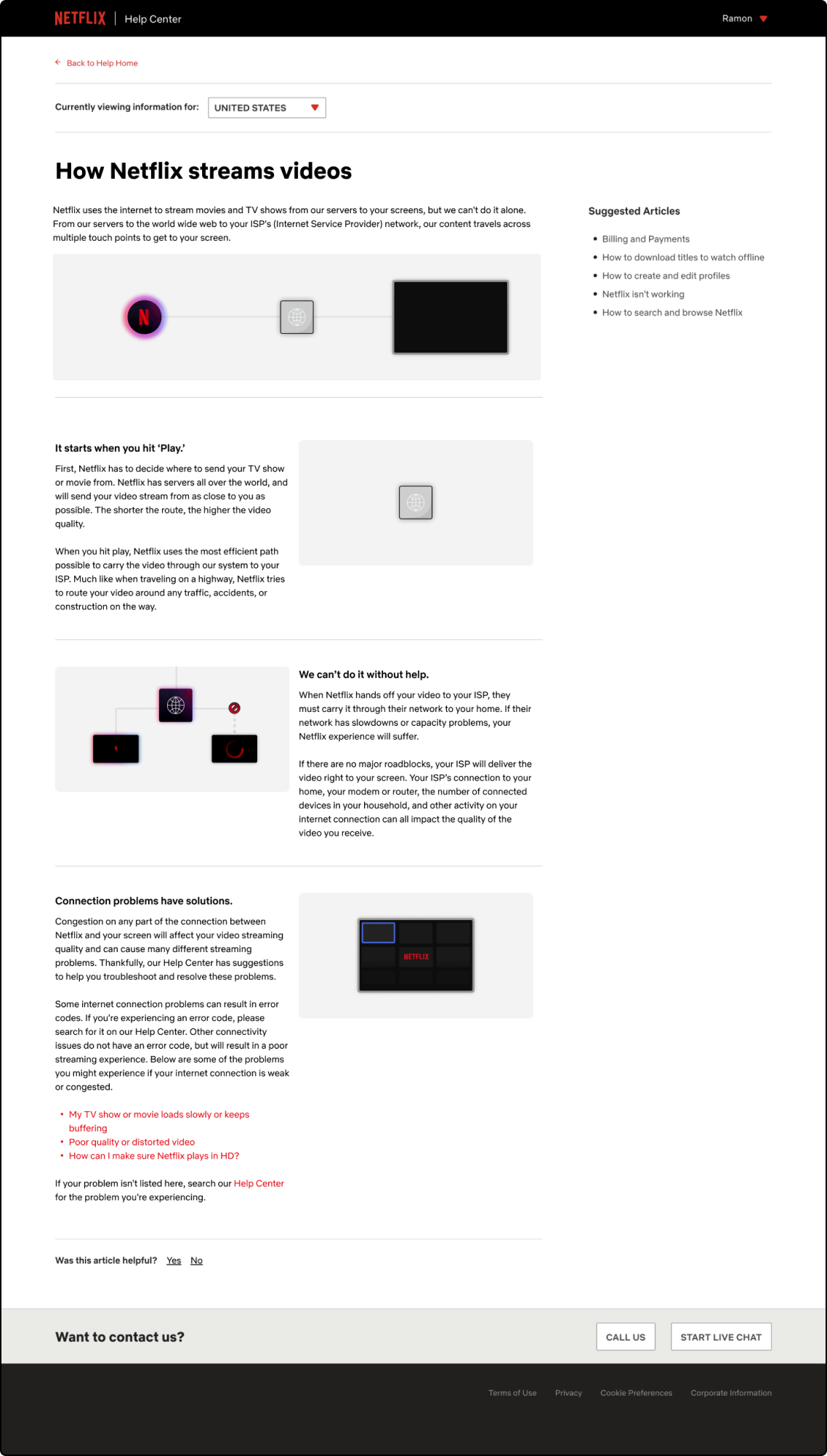
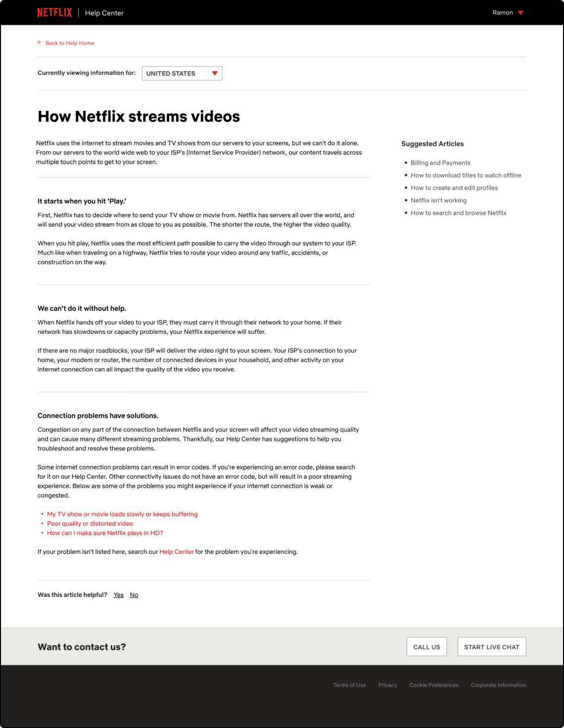
“What path does Netflix content take before it gets to your screen?”
Percentage of participants that aswered questions correctly
“What path does Netflix content take before it gets to your screen?”
Percentage of participants that aswered questions correctly
“What path does Netflix content take before it gets to your screen?”
Percentage of participants that aswered questions correctly
“What path does Netflix content take before it gets to your screen?”
Percentage of participants that aswered questions correctly

Contact Rate
Sample question
“After seeing this article, how likely are you to contact customer service?”
(7-point Rating Scale: 1=not likely at all, 7=very likely)
“After seeing this article, how likely are you to contact customer service?”
(7-point Rating Scale: 1=not likely at all, 7=very likely)
“After seeing this article, how likely are you to contact customer service?”
(7-point Rating Scale: 1=not likely at all, 7=very likely)
“After seeing this article, how likely are you to contact customer service?”
(7-point Rating Scale: 1=not likely at all, 7=very likely)
“After seeing this article, how likely are you to contact customer service?”
(7-point Rating Scale: 1=not likely at all, 7=very likely)

Comments
“Choose 3 words to describe the visuals used in this article.”
“Choose 3 words to describe the visuals used in this article.”
“Choose 3 words to describe the visuals used in this article.”
“eye catchy, simple, memorable explicit, helpful, and clear (the animations can help you understand the process better, and just the right amount of information is presented)”
“eye catchy, simple, memorable explicit, helpful, and clear (the animations can help you understand the process better, and just the right amount of information is presented)”
“eye catchy, simple, memorable explicit, helpful, and clear (the animations can help you understand the process better, and just the right amount of information is presented)”
“eye catchy, simple, memorable explicit, helpful, and clear (the animations can help you understand the process better, and just the right amount of information is presented)”
“eye catchy, simple, memorable explicit, helpful, and clear (the animations can help you understand the process better, and just the right amount of information is presented)”
“explicit, helpful, and clear (the animations can help you understand the process better, and just the right amount of information is presented) ”
“explicit, helpful, and clear (the animations can help you understand the process better, and just the right amount of information is presented) ”
“explicit, helpful, and clear (the animations can help you understand the process better, and just the right amount of information is presented) ”
“explicit, helpful, and clear (the animations can help you understand the process better, and just the right amount of information is presented) ”
“explicit, helpful, and clear (the animations can help you understand the process better, and just the right amount of information is presented) ”
“familiar: representative of actual netflix scenarios, like the N and the buffering.
logical: showing the pathways
pleasing: nicely designed and nice colors and graphics”
“familiar: representative of actual netflix scenarios, like the N and the buffering.
logical: showing the pathways
pleasing: nicely designed and nice colors and graphics”
“familiar: representative of actual netflix scenarios, like the N and the buffering.
logical: showing the pathways
pleasing: nicely designed and nice colors and graphics”
“familiar: representative of actual netflix scenarios, like the N and the buffering.
logical: showing the pathways
pleasing: nicely designed and nice colors and graphics”
“familiar: representative of actual netflix scenarios, like the N and the buffering.
logical: showing the pathways
pleasing: nicely designed and nice colors and graphics”
Findings for 'how-to' articles
Findings for 'how-to' articles
The results for effort, helpfulness, and contact rate were all pretty flat. The helpfulness scores for participants in the control group(text only) were slightly lower than the visuals group, but not as low as they were in other testing.
The results for effort, helpfulness, and contact rate were all pretty flat. The helpfulness scores for participants in the control group(text only) were slightly lower than the visuals group, but not as low as they were in other testing.
The results for effort, helpfulness, and contact rate were all pretty flat. The helpfulness scores for participants in the control group(text only) were slightly lower than the visuals group, but not as low as they were in other testing.
The results for effort, helpfulness, and contact rate were all pretty flat. The helpfulness scores for participants in the control group(text only) were slightly lower than the visuals group, but not as low as they were in other testing.
The results for effort, helpfulness, and contact rate were all pretty flat. The helpfulness scores for participants in the control group(text only) were slightly lower than the visuals group, but not as low as they were in other testing.
How-to (with visuals)
How-to (text only)
Effort
Sample question
“How easy or difficult is it to understand the steps in this article?”
(7-point Rating Scale: 1=very difficult, 7=very easy)
“How easy or difficult is it to understand the steps in this article?”
(7-point Rating Scale: 1=very difficult, 7=very easy)
“How easy or difficult is it to understand the steps in this article?”
(7-point Rating Scale: 1=very difficult, 7=very easy)
“How easy or difficult is it to understand the steps in this article?”
(7-point Rating Scale: 1=very difficult, 7=very easy)
“How easy or difficult is it to understand the steps in this article?”
(7-point Rating Scale: 1=very difficult, 7=very easy)

Helpfulness
Sample question
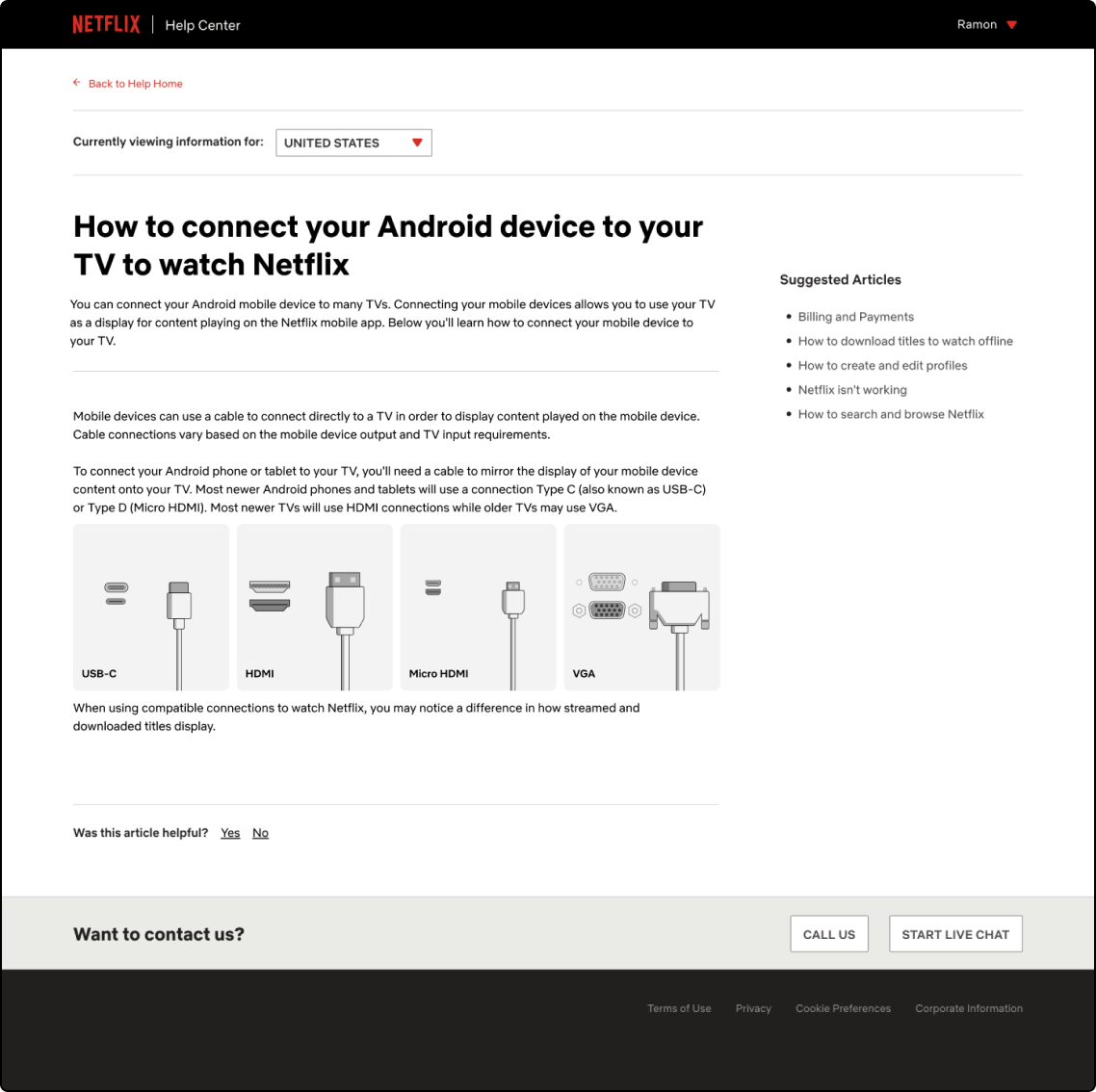
“Using the image linked in the previous question, please select the connection that corresponds with an HDMI connection”
Percentage of participants that aswered questions correctly
“Using the image linked in the previous question, please select the connection that corresponds with an HDMI connection”
Percentage of participants that aswered questions correctly
“Using the image linked in the previous question, please select the connection that corresponds with an HDMI connection”
Percentage of participants that aswered questions correctly
“Using the image linked in the previous question, please select the connection that corresponds with an HDMI connection”
Percentage of participants that aswered questions correctly
“Using the image linked in the previous question, please select the connection that corresponds with an HDMI connection”
Percentage of participants that aswered questions correctly

Contact Rate
Sample question
“After seeing this article, how likely are you to contact customer service?”
(7-point Rating Scale: 1=not likely at all, 7=very likely)
“After seeing this article, how likely are you to contact customer service?”
(7-point Rating Scale: 1=not likely at all, 7=very likely)
“After seeing this article, how likely are you to contact customer service?”
(7-point Rating Scale: 1=not likely at all, 7=very likely)
“After seeing this article, how likely are you to contact customer service?”
(7-point Rating Scale: 1=not likely at all, 7=very likely)
“After seeing this article, how likely are you to contact customer service?”
(7-point Rating Scale: 1=not likely at all, 7=very likely)

Comments
“Choose 3 words to describe the visuals used in this article.”
“Choose 3 words to describe the visuals used in this article.”
“Choose 3 words to describe the visuals used in this article.”
“Clear, intuitive, abundant. It's pretty straight forward and the images look exactly like the actual cords and ports do in real life. ”
“Clear, intuitive, abundant. It's pretty straight forward and the images look exactly like the actual cords and ports do in real life. ”
“Clear, intuitive, abundant. It's pretty straight forward and the images look exactly like the actual cords and ports do in real life. ”
“Clear, intuitive, abundant. It's pretty straight forward and the images look exactly like the actual cords and ports do in real life. ”
“Clear, intuitive, abundant. It's pretty straight forward and the images look exactly like the actual cords and ports do in real life. ”
“Clear, intuitive, abundant. It's pretty straight forward and the images look exactly like the actual cords and ports do in real life. ”
“Clear, intuitive, abundant. It's pretty straight forward and the images look exactly like the actual cords and ports do in real life. ”
“Clear, intuitive, abundant. It's pretty straight forward and the images look exactly like the actual cords and ports do in real life. ”
“Clear, intuitive, abundant. It's pretty straight forward and the images look exactly like the actual cords and ports do in real life. ”
“Clear, intuitive, abundant. It's pretty straight forward and the images look exactly like the actual cords and ports do in real life. ”
“Simple, Helpful, Direct”
“Simple, Helpful, Direct”
“Simple, Helpful, Direct”
“Simple, Helpful, Direct”
“Simple, Helpful, Direct”
Summary
Summary
Overall, the results from the testing show that the visuals tended to have a flat to slightly improved effect on the areas of effort, helpfulness, and contact rate.
Here are a few of my observations from the test data:
- Participants who self-rated themselves as ‘moderately tech-savvy’ or ‘not very tech-savvy’ were more likely to respond favorably to the visuals even for simple tasks. They also commented that having visuals in the articles gave them a sense of confidence and security in their ability to complete the tasks.
- Most participants who rated themselves as ‘very tech-savvy’ didn’t mind having visuals in the articles and some even noted that they may be useful for people not as tech-savvy.
- Participants in the control(text-only) groups stated that visuals were uneccessary but those groups tended to do more poorly in the helpfulness category when compared to those in the visuals groups. Information recall and time on task were both impacted negatively in these cases.
- In general, hardly any of the participants wanted to reach out to customer service to resolve their issues. Most mentioned that time was a factor in that decision and some even stated that reaching out to customer service felt “embarassing” or “as if I’m admitting defeat”. Which makes a strong case for continuing to build out self-service on the help center.
Takeaways.
Thinking globally
One of the advantages of working on a global team is the different perspectives that come along with that. Although I strive to make designs that are accessible to as many people as possible, even I can get caught up in a North American/US centric view of the world. This came up when sketching wall plugs for this project. One of my colleagues off-handedly mentioned that the wall plug I had sketched didn’t look like her wall plug in Europe. That was a sort of light bulb moment for me to be aware and remember that these visuals were to serve a global audience.
One of the advantages of working on a global team is the different perspectives that come along with that. Although I strive to make designs that are accessible to as many people as possible, even I can get caught up in a North American/US centric view of the world. This came up when sketching wall plugs for this project. One of my colleagues off-handedly mentioned that the wall plug I had sketched didn’t look like her wall plug in Europe. That was a sort of light bulb moment for me to be aware and remember that these visuals were to serve a global audience.
One of the advantages of working on a global team is the different perspectives that come along with that. Although I strive to make designs that are accessible to as many people as possible, even I can get caught up in a North American/US centric view of the world. This came up when sketching wall plugs for this project. One of my colleagues off-handedly mentioned that the wall plug I had sketched didn’t look like her wall plug in Europe. That was a sort of light bulb moment for me to be aware and remember that these visuals were to serve a global audience.
One of the advantages of working on a global team is the different perspectives that come along with that. Although I strive to make designs that are accessible to as many people as possible, even I can get caught up in a North American/US centric view of the world. This came up when sketching wall plugs for this project. One of my colleagues off-handedly mentioned that the wall plug I had sketched didn’t look like her wall plug in Europe. That was a sort of light bulb moment for me to be aware and remember that these visuals were to serve a global audience.
One of the advantages of working on a global team is the different perspectives that come along with that. Although I strive to make designs that are accessible to as many people as possible, even I can get caught up in a North American/US centric view of the world. This came up when sketching wall plugs for this project. One of my colleagues off-handedly mentioned that the wall plug I had sketched didn’t look like her wall plug in Europe. That was a sort of light bulb moment for me to be aware and remember that these visuals were to serve a global audience.
A few words on layouts
A few words on layouts
The sequence in which information is laid out is just as important as the information itself. One of the areas I would’ve liked to explore and experiment with more are the layouts for on device help center articles. For example, how might a short form trouble shooting article look on a device such as a TV?
The sequence in which information is laid out is just as important as the information itself. One of the areas I would’ve liked to explore and experiment with more are the layouts for on device help center articles. For example, how might a short form trouble shooting article look on a device such as a TV?
The sequence in which information is laid out is just as important as the information itself. One of the areas I would’ve liked to explore and experiment with more are the layouts for on device help center articles. For example, how might a short form trouble shooting article look on a device such as a TV?
The sequence in which information is laid out is just as important as the information itself. One of the areas I would’ve liked to explore and experiment with more are the layouts for on device help center articles. For example, how might a short form trouble shooting article look on a device such as a TV?
The sequence in which information is laid out is just as important as the information itself. One of the areas I would’ve liked to explore and experiment with more are the layouts for on device help center articles. For example, how might a short form trouble shooting article look on a device such as a TV?
More appreciation for user testing
More appreciation for user testing
User testing is something that I was familiar with before this project but not something that I had done on my own. I was fortunate enough to have a great resource from our customer insights team to help guide me and to check over my user testing plan. Seeing the results come back and having them support our hypothesis that visuals on the help center work to give users a better understanding of the content was rewarding.
User testing is something that I was familiar with before this project but not something that I had done on my own. I was fortunate enough to have a great resource from our customer insights team to help guide me and to check over my user testing plan. Seeing the results come back and having them support our hypothesis that visuals on the help center work to give users a better understanding of the content was rewarding.
User testing is something that I was familiar with before this project but not something that I had done on my own. I was fortunate enough to have a great resource from our customer insights team to help guide me and to check over my user testing plan. Seeing the results come back and having them support our hypothesis that visuals on the help center work to give users a better understanding of the content was rewarding.
User testing is something that I was familiar with before this project but not something that I had done on my own. I was fortunate enough to have a great resource from our customer insights team to help guide me and to check over my user testing plan. Seeing the results come back and having them support our hypothesis that visuals on the help center work to give users a better understanding of the content was rewarding.
User testing is something that I was familiar with before this project but not something that I had done on my own. I was fortunate enough to have a great resource from our customer insights team to help guide me and to check over my user testing plan. Seeing the results come back and having them support our hypothesis that visuals on the help center work to give users a better understanding of the content was rewarding.