NETFLIX
Help Center Navigation
Help Center Navigation
Intro.
Intro.
Role: Visual Designer | UX Designer
Team: Eunice Louie | Ramon Sandino
Tools: Figma
For this project I explored adding navigation to Netflix’s customer service site. When I began working on the project, the CS site’s navigation only had a few options: a link to the product a link to account info, and a ‘back to’ if you had already visited another article. I worked on this project with a product designer from customer service, my manager, and our SEO manager.
Netflix offers several ways for customers to reach out to contact customer service and to get help with issues or questions they might have. There are however, a large number of customers that prefer to try and resolve issues on their own before reaching out to customer service. As part of the Content Strategy team at Netflix, I worked on creating a set of visual assets and guidelines to help guide customers and customer service agents to solutions for their issues. The team consisted of myself, another visual designer, and a content editor. We had weekly critiques and shareouts with members of the customer health design team and bi-weekly shareouts with a broader team of stakeholders from the customer service organization. Although the catalyst for this project began as a small request for an illustration from an editor, it ended up becoming one of the larger projects I worked on.
Netflix offers several ways for customers to reach out to contact customer service and to get help with issues or questions they might have. There are however, a large number of customers that prefer to try and resolve issues on their own before reaching out to customer service. As part of the Content Strategy team at Netflix, I worked on creating a set of visual assets and guidelines to help guide customers and customer service agents to solutions for their issues. The team consisted of myself, another visual designer, and a content editor. We had weekly critiques and shareouts with members of the customer health design team and bi-weekly shareouts with a broader team of stakeholders from the customer service organization. Although the catalyst for this project began as a small request for an illustration from an editor, it ended up becoming one of the larger projects I worked on.
Netflix offers several ways for customers to reach out to contact customer service and to get help with issues or questions they might have. There are however, a large number of customers that prefer to try and resolve issues on their own before reaching out to customer service. As part of the Content Strategy team at Netflix, I worked on creating a set of visual assets and guidelines to help guide customers and customer service agents to solutions for their issues. The team consisted of myself, another visual designer, and a content editor. We had weekly critiques and shareouts with members of the customer health design team and bi-weekly shareouts with a broader team of stakeholders from the customer service organization. Although the catalyst for this project began as a small request for an illustration from an editor, it ended up becoming one of the larger projects I worked on.
Problem.
Netflix’s help center is where customers can turn to whenever they need help resolving issues relating to a wide variety of topics. The issue that we were seeing was that many customers were entering the site/help articles via web search, but once inside had no way of navigating to other articles/topics.
The Netflix Help Center is full of information to help customers resolve their issues, but there’s a huge opportunity to leverage simple to follow visual instructions. While customer service agents have access to step-by-step visual guides, customers do not. Here are a few of the other problems that I was attempting to solve for:
- The visual guides use screen shots directly from the various apps so the content is not ever green and can be time consuming to maintain at scale.
- The visual assets aren’t localized. Netflix is available for streaming in ~190 countries and their customer service site supports roughly 30 languages.
- The visuals that do exist in the help center are outdated and lack a cohesive visual language.
- The visuals are all mostly static; some concepts could be better understood better if explained with animations.
- The illustrations used in product were too stylized to be used as visuals for step-by-step instructions in the help center. A different style of illustration was needed that was more functional and easier to understand.
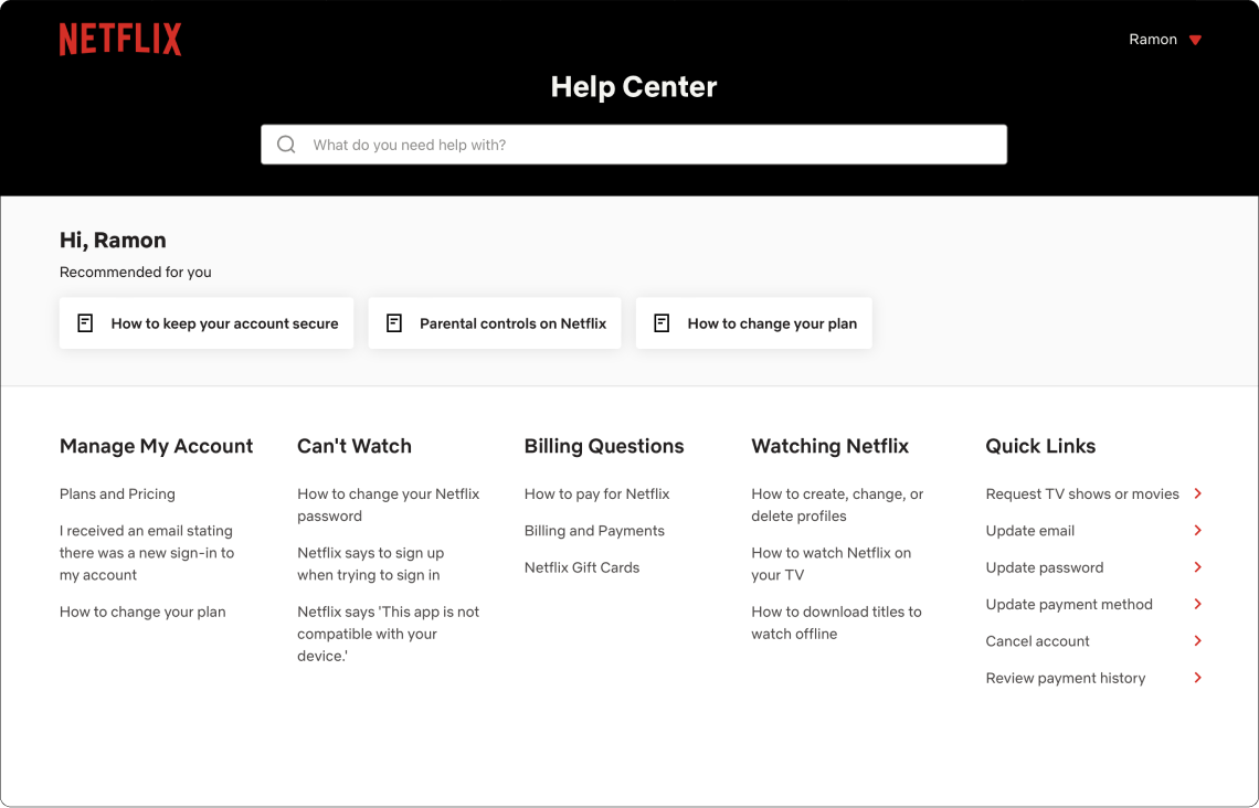
The main home page for the help center contains some navigation links at the bottom but they are more like quick links and aren’t persistent throughout the site. This is also the only place on the site with a universal site-wide search. Most customers aren’t aware that this page exists since the majority of the traffic that comes to the help center arrives via search.
The Netflix Help Center is full of information to help customers resolve their issues, but there’s a huge opportunity to leverage simple to follow visual instructions. While customer service agents have access to step-by-step visual guides, customers do not. Here are a few of the other problems that I was attempting to solve for:
- The visual guides use screen shots directly from the various apps so the content is not ever green and can be time consuming to maintain at scale.
- The visual assets aren’t localized. Netflix is available for streaming in ~190 countries and their customer service site supports roughly 30 languages.
- The visuals that do exist in the help center are outdated and lack a cohesive visual language.
- The visuals are all mostly static; some concepts could be better understood better if explained with animations.
- The illustrations used in product were too stylized to be used as visuals for step-by-step instructions in the help center. A different style of illustration was needed that was more functional and easier to understand.
This could lead to a few issues for customers seeking for answers on the help center:
The Netflix Help Center is full of information to help customers resolve their issues, but there’s a huge opportunity to leverage simple to follow visual instructions. While customer service agents have access to step-by-step visual guides, customers do not. Here are a few of the other problems that I was attempting to solve for:
- The visual guides use screen shots directly from the various apps so the content is not ever green and can be time consuming to maintain at scale.
- The visual assets aren’t localized. Netflix is available for streaming in ~190 countries and their customer service site supports roughly 30 languages.
- The visuals that do exist in the help center are outdated and lack a cohesive visual language.
- The visuals are all mostly static; some concepts could be better understood better if explained with animations.
- The illustrations used in product were too stylized to be used as visuals for step-by-step instructions in the help center. A different style of illustration was needed that was more functional and easier to understand.
- If their search led them to an article unrelated to their issue, they’d have to go back to the search results and could end up on a third party site with incorrect or outdated resolution instructions.
- Customers could end up on articles that were tangetially related to their issue, but had no way of going to groupings of topics that could help in resolving their issue.
The Netflix Help Center is full of information to help customers resolve their issues, but there’s a huge opportunity to leverage simple to follow visual instructions. While customer service agents have access to step-by-step visual guides, customers do not. Here are a few of the other problems that I was attempting to solve for:
- The visual guides use screen shots directly from the various apps so the content is not ever green and can be time consuming to maintain at scale.
- The visual assets aren’t localized. Netflix is available for streaming in ~190 countries and their customer service site supports roughly 30 languages.
- The visuals that do exist in the help center are outdated and lack a cohesive visual language.
- The visuals are all mostly static; some concepts could be better understood better if explained with animations.
- The illustrations used in product were too stylized to be used as visuals for step-by-step instructions in the help center. A different style of illustration was needed that was more functional and easier to understand.
Our goals were the following:
The Netflix Help Center is full of information to help customers resolve their issues, but there’s a huge opportunity to leverage simple to follow visual instructions. While customer service agents have access to step-by-step visual guides, customers do not. Here are a few of the other problems that I was attempting to solve for:
- The visual guides use screen shots directly from the various apps so the content is not ever green and can be time consuming to maintain at scale.
- The visual assets aren’t localized. Netflix is available for streaming in ~190 countries and their customer service site supports roughly 30 languages.
- The visuals that do exist in the help center are outdated and lack a cohesive visual language.
- The visuals are all mostly static; some concepts could be better understood better if explained with animations.
- The illustrations used in product were too stylized to be used as visuals for step-by-step instructions in the help center. A different style of illustration was needed that was more functional and easier to understand.
- Offer customers an additional way to find the information they were looking for so that the could back to streaming more quickly. We realize that we would never be able to compete with a web search but we wanted to offer another way of viewing information that didn’t feel like they were hitting a dead end once they got to the customer service site.
- By grouping and organizing our articles/information into topics and presenting them in an easier to parse format, we could improve or search ratings so that customers would be presented with our resolutions first on search and not have to rely on third party sites.
The Netflix Help Center is full of information to help customers resolve their issues, but there’s a huge opportunity to leverage simple to follow visual instructions. While customer service agents have access to step-by-step visual guides, customers do not. Here are a few of the other problems that I was attempting to solve for:
- The visual guides use screen shots directly from the various apps so the content is not ever green and can be time consuming to maintain at scale.
- The visual assets aren’t localized. Netflix is available for streaming in ~190 countries and their customer service site supports roughly 30 languages.
- The visuals that do exist in the help center are outdated and lack a cohesive visual language.
- The visuals are all mostly static; some concepts could be better understood better if explained with animations.
- The illustrations used in product were too stylized to be used as visuals for step-by-step instructions in the help center. A different style of illustration was needed that was more functional and easier to understand.
Site Organization.
Site Organization.
In order to help me determine how to organize the information in the site nav, I worked together with our SEO manager and a few of our help center editors to help determine the make up of the topics and subtopics.
Due to COVID restrictions, we weren’t able to go onsite to speak to customer service agents, but thanks to the magic of the internet, we were able to oberve and interview them remotely. The interviews took place over 4 days with 2 sessions each day. The groups consisted of about 5-6 agents each from different regions around the world (EMEA, APAC, LATAM, and UCAN) with tenure between 6 months to 2 years and were focused on the topic of visuals in the knowledge base.
Due to COVID restrictions, we weren’t able to go onsite to speak to customer service agents, but thanks to the magic of the internet, we were able to oberve and interview them remotely. The interviews took place over 4 days with 2 sessions each day. The groups consisted of about 5-6 agents each from different regions around the world (EMEA, APAC, LATAM, and UCAN) with tenure between 6 months to 2 years and were focused on the topic of visuals in the knowledge base.

I then mapped out what the current flow looks like for customers coming in from web search.
Highlights from the interviews:
- The majority of agents (%99) agreed that adding more visuals to the knowledge base would be helpful to them when assisting a customer.
- Agents requested animated guides for topics that are more complicated.
- When asked what could be improved agents responded:
“I wish the visuals were more up to date. Some of them look really old”
“It would be nice if we could share these with customers so that they could better understand our instructions”.

Then I looked at what the flow could look like after adding topics and subtopics.
I had recently received a Lego set that I used for a team building exercise at work and had the Lego instructions fresh in my mind. What drew my attention was the fact that their instruction guide lacked nearly any words except for the logo. Using shapes, arrows, and numbers, they were able to create guides for some pretty complex objects.
I also keep a folder in my email of examples of visual design that I find useful or interesting so that was another place I went to look for inspiration. Their use of contrasting colors to draw focus, the use of outlines to clearly seperate objects from each other, and the playful yet functional style they all use were all elements I wanted to bring to the visuals for the help center.

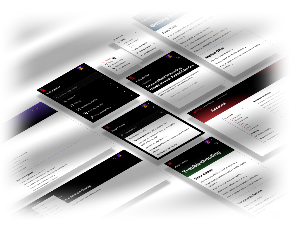
Mocks.
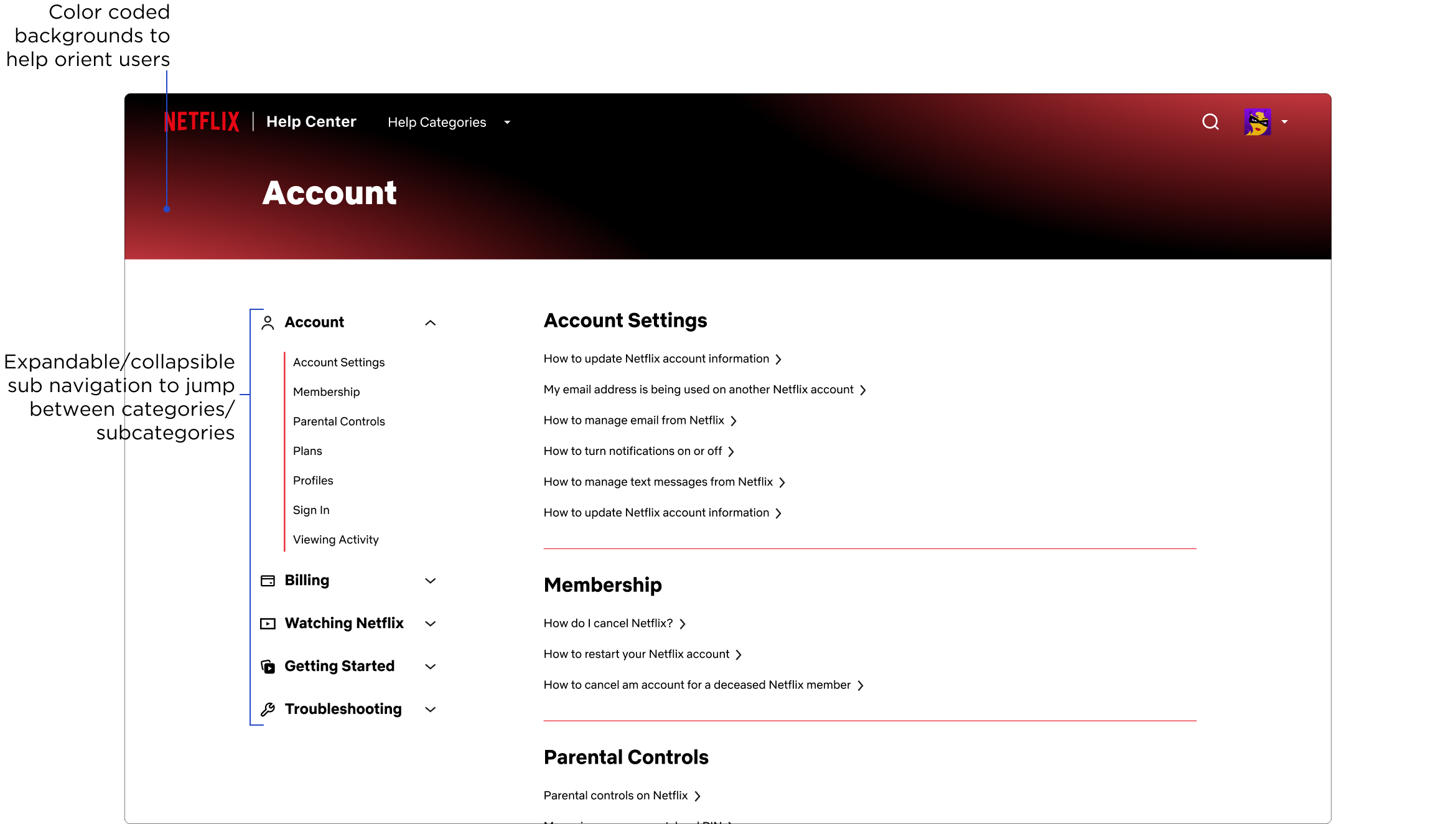
To create mockups quickly, I used components and elements from our design system. I kept the link to the main product page and to the home page for the help center in the upper left but added a dropdown for the help categories to the right of them. On the far right of the nav bar I added a search icon so that search was more accessible. The search icon would expand when selected and display ‘Search Help Center’ to prevent users from confusing it for a title/content search. A breadcrumb navigation was also added above the article title to provide users with more context about which category the currently viewed article is located in.
Due to COVID restrictions, we weren’t able to go onsite to speak to customer service agents, but thanks to the magic of the internet, we were able to oberve and interview them remotely. The interviews took place over 4 days with 2 sessions each day. The groups consisted of about 5-6 agents each from different regions around the world (EMEA, APAC, LATAM, and UCAN) with tenure between 6 months to 2 years and were focused on the topic of visuals in the knowledge base.
Due to COVID restrictions, we weren’t able to go onsite to speak to customer service agents, but thanks to the magic of the internet, we were able to oberve and interview them remotely. The interviews took place over 4 days with 2 sessions each day. The groups consisted of about 5-6 agents each from different regions around the world (EMEA, APAC, LATAM, and UCAN) with tenure between 6 months to 2 years and were focused on the topic of visuals in the knowledge base.
DESKTOP
NAV DEFAULT

CATEGORIES DROPDOWN EXPANDED

CATEGORIES DROPDOWN HOVER

CATEGORIES DROPDOWN SELECTED

SEARCH EXPANDED

SEARCH FILLED
SEARCH FILLED

MOBILE
MOBILE NAV DEFAULT

MOBILE NAV NOT SIGNED IN

MOBILE NAV EXPANDED

MOBILE NAV SELECTED ITEM

MOBILE NAV SEARCH FILLED

CATEGORY PAGES
DESKTOP


CATEGORY PAGES
MOBILE


